

Informations
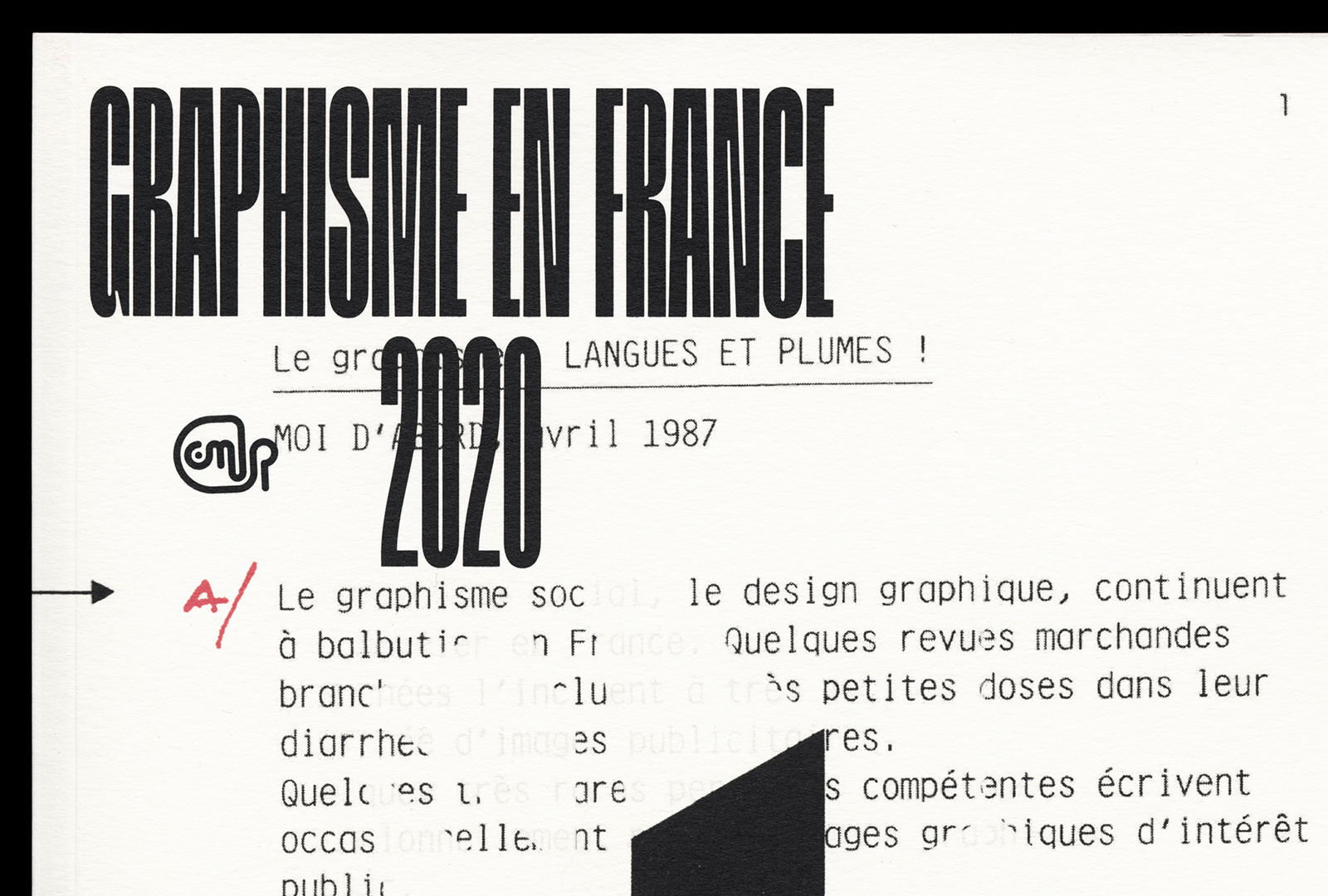
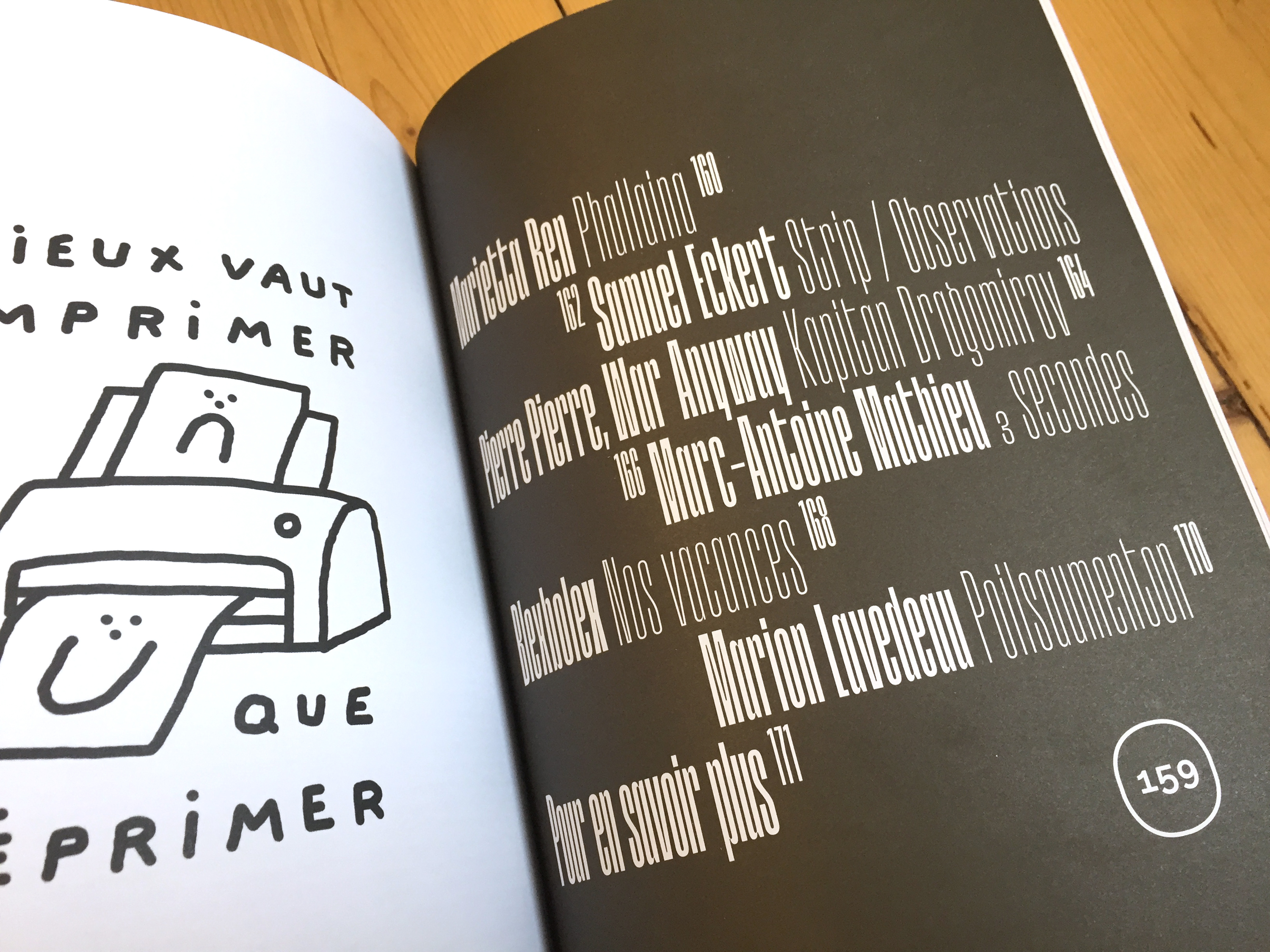
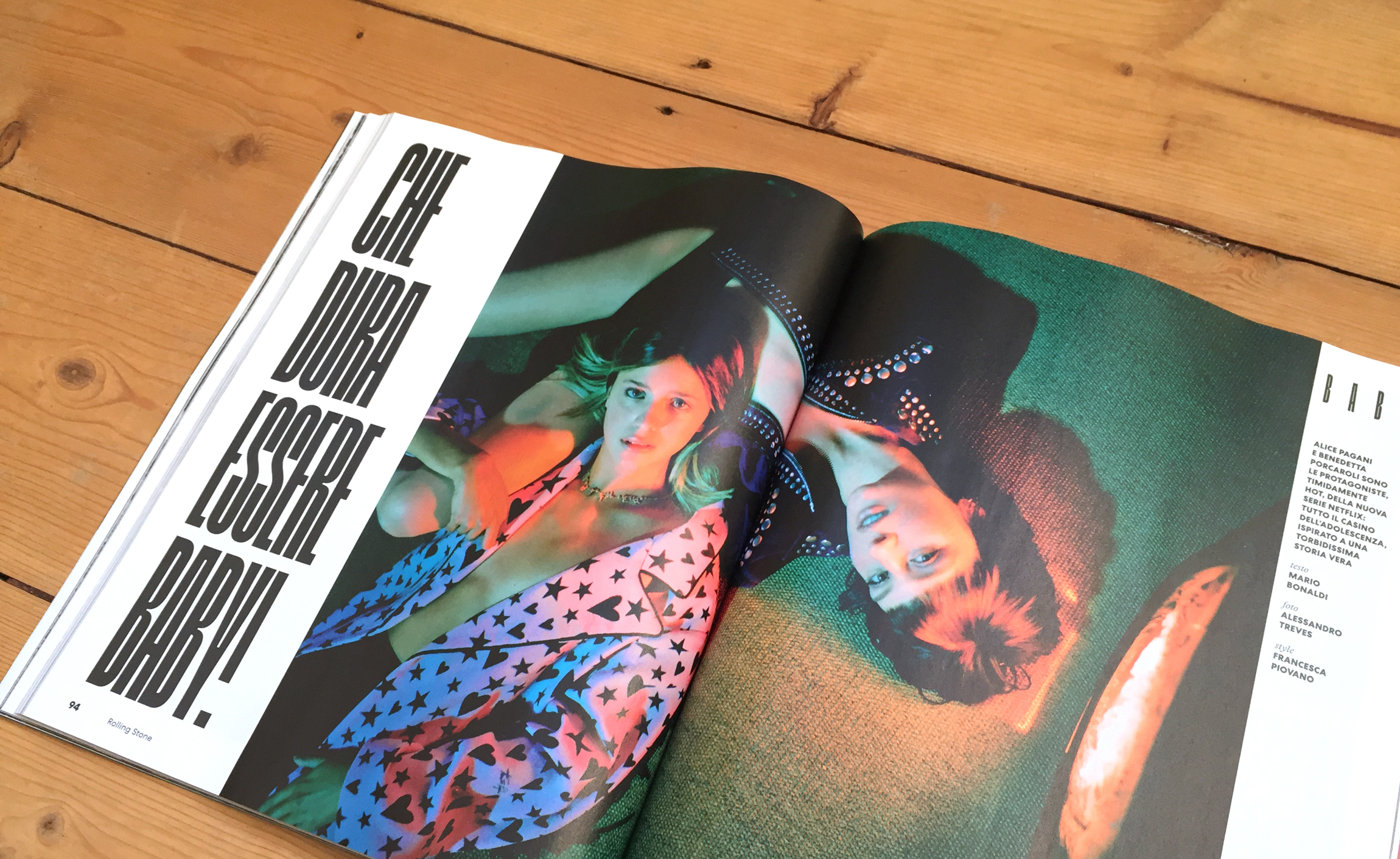
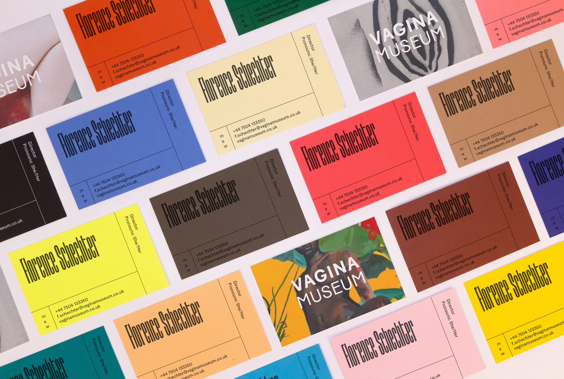
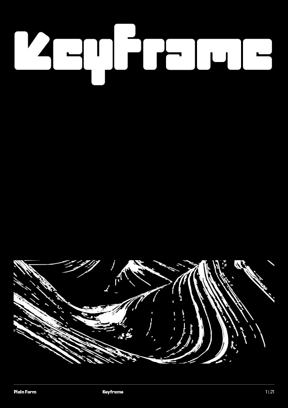
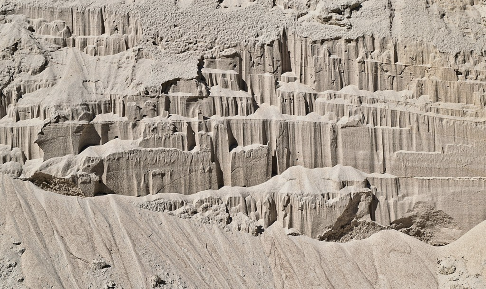
Product of reinforced concrete and a soldering iron, Keyframe sports a monumental, architectural look. Its stems, linear and solid, were built to stay; the kind of construction that only the minuscule but repeated assaults of time could slowly begin to soften.
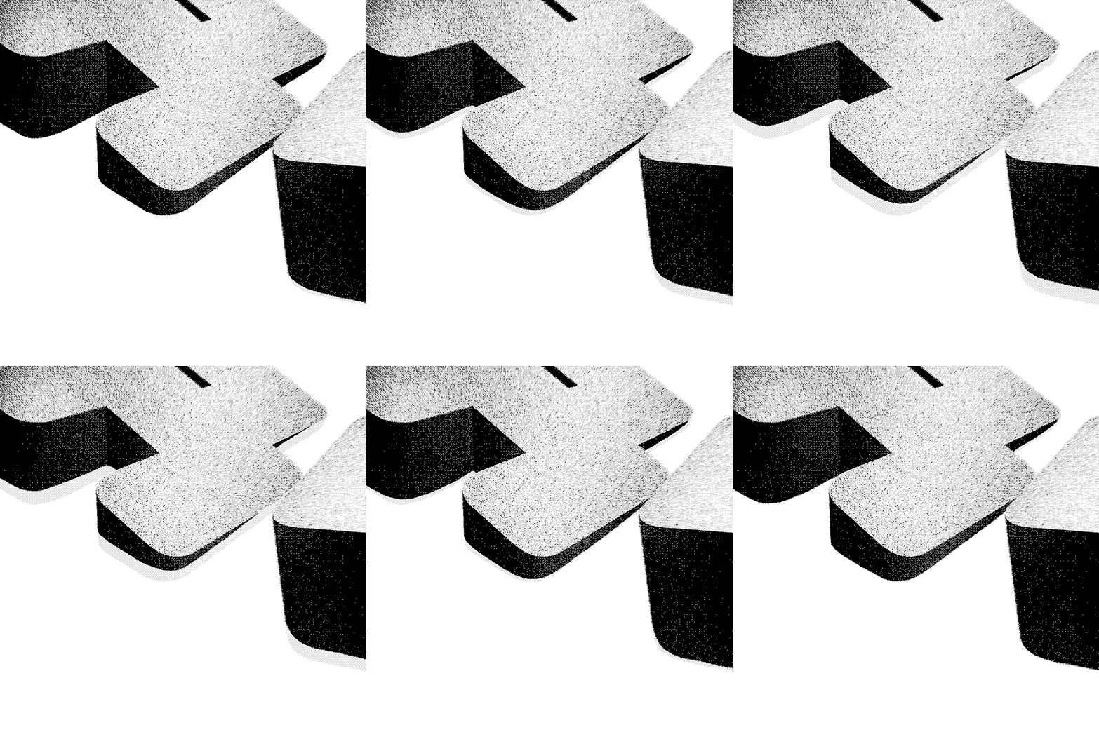
Keyframe is all about simplification, hints rather than definitions, like interpreting history from a few leftover traces. With regularity—often associated with such heavily constructed typefaces—broken by missing parts and unexpected extensions, words become like abstract decors, oscillating between hardness and fragility.
5 styles
Keyframe
Thin
Light
Regular
Bold
Heavy


Information
Design
Lucas Descroix
Release year
2023Font formats
OTF, WOFF, WOFF2
Glyph count
ca. 620 glyphs
Coverage
Extended Latin (incl. Vietnamese)
For more information on the character set and language coverage, please have a look at the PDF specimen.OpenType features
Borders & patterns (ss01)
A
Closed lowercase forms (ss02)
D
Dotted forms (ss03)
Tabular figures (tnum)
Ca.
Lining figures (lnum)
Meter
Numerators (numr)
H
Denominators (dnom)


