

Informations
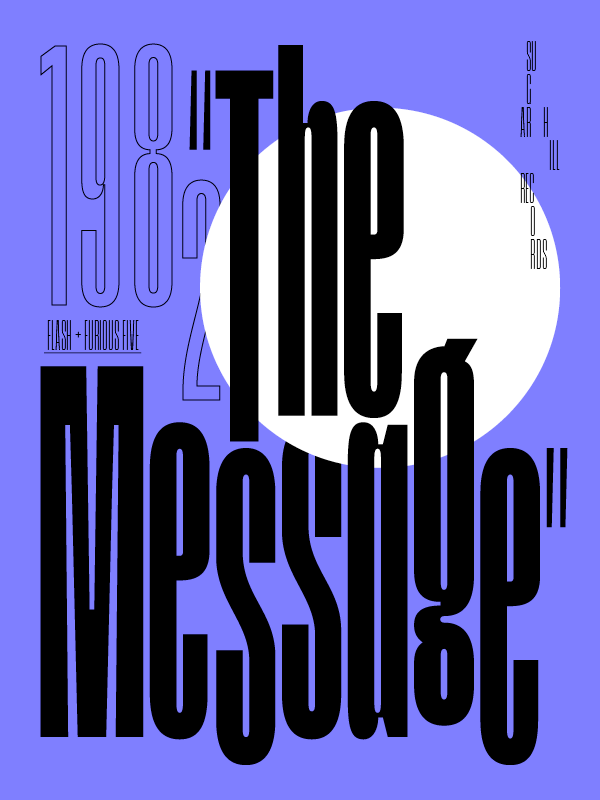
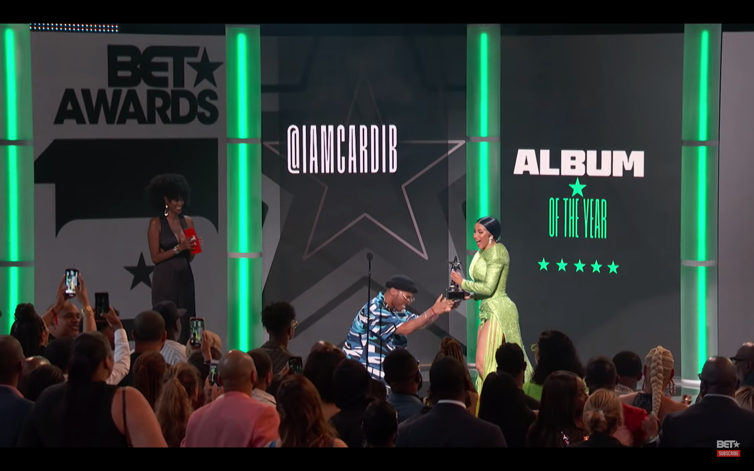
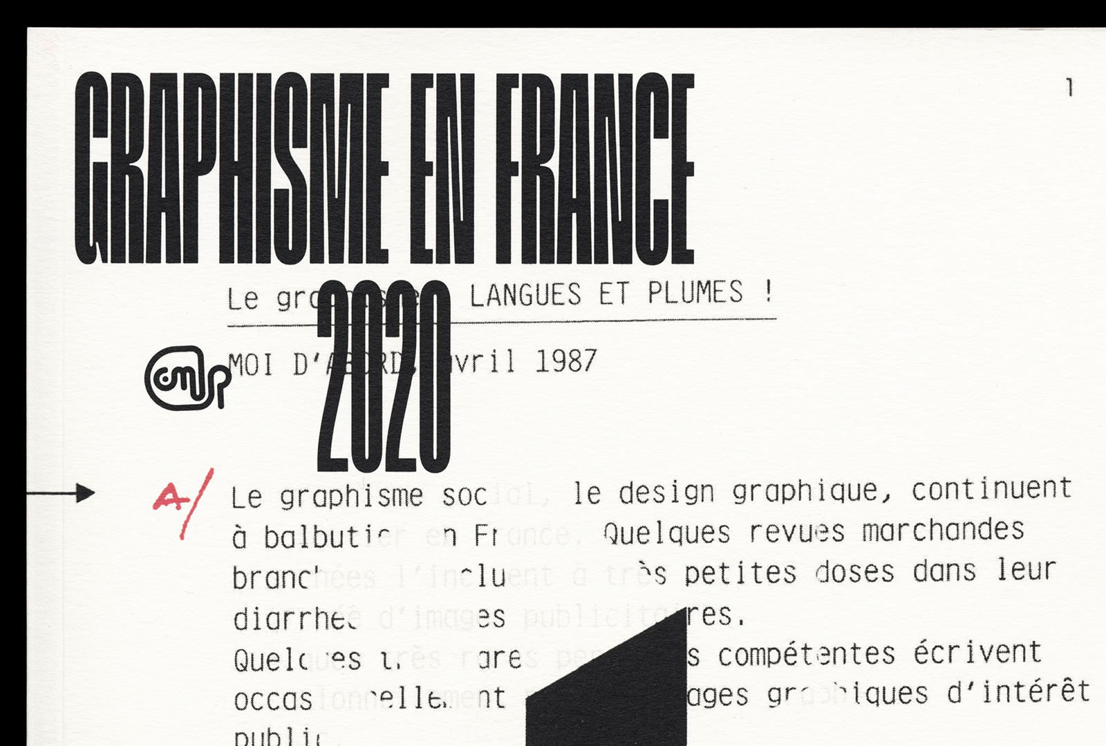
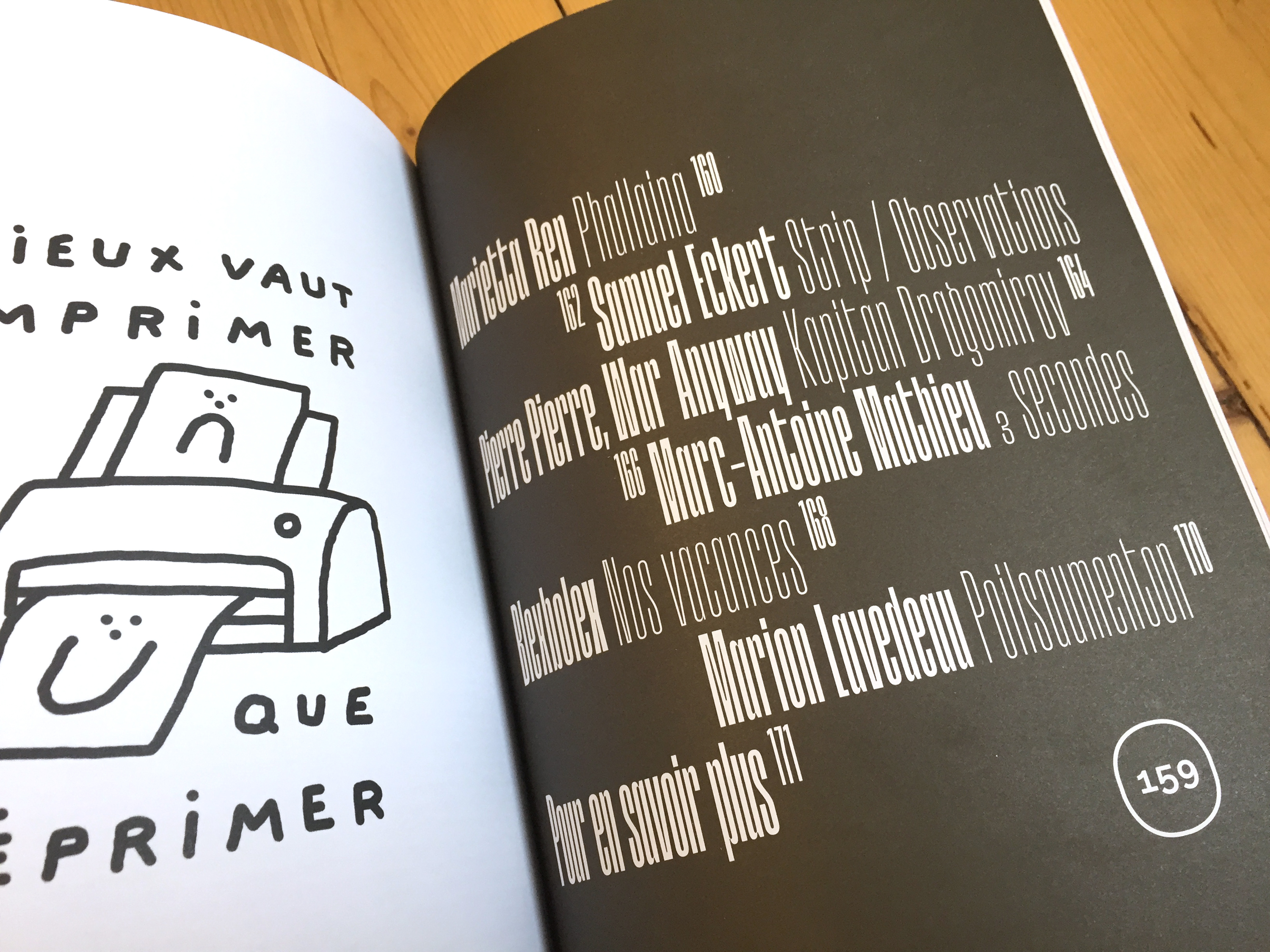
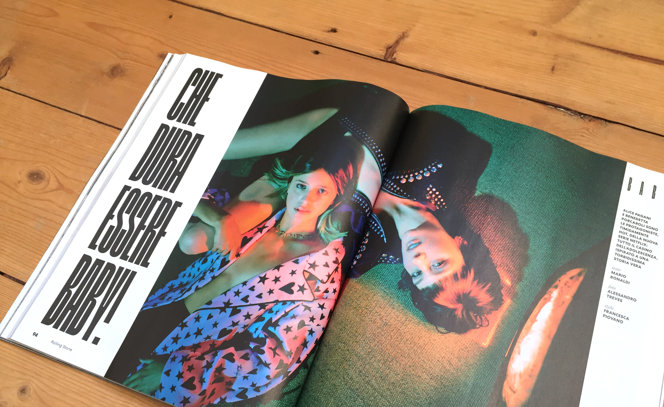
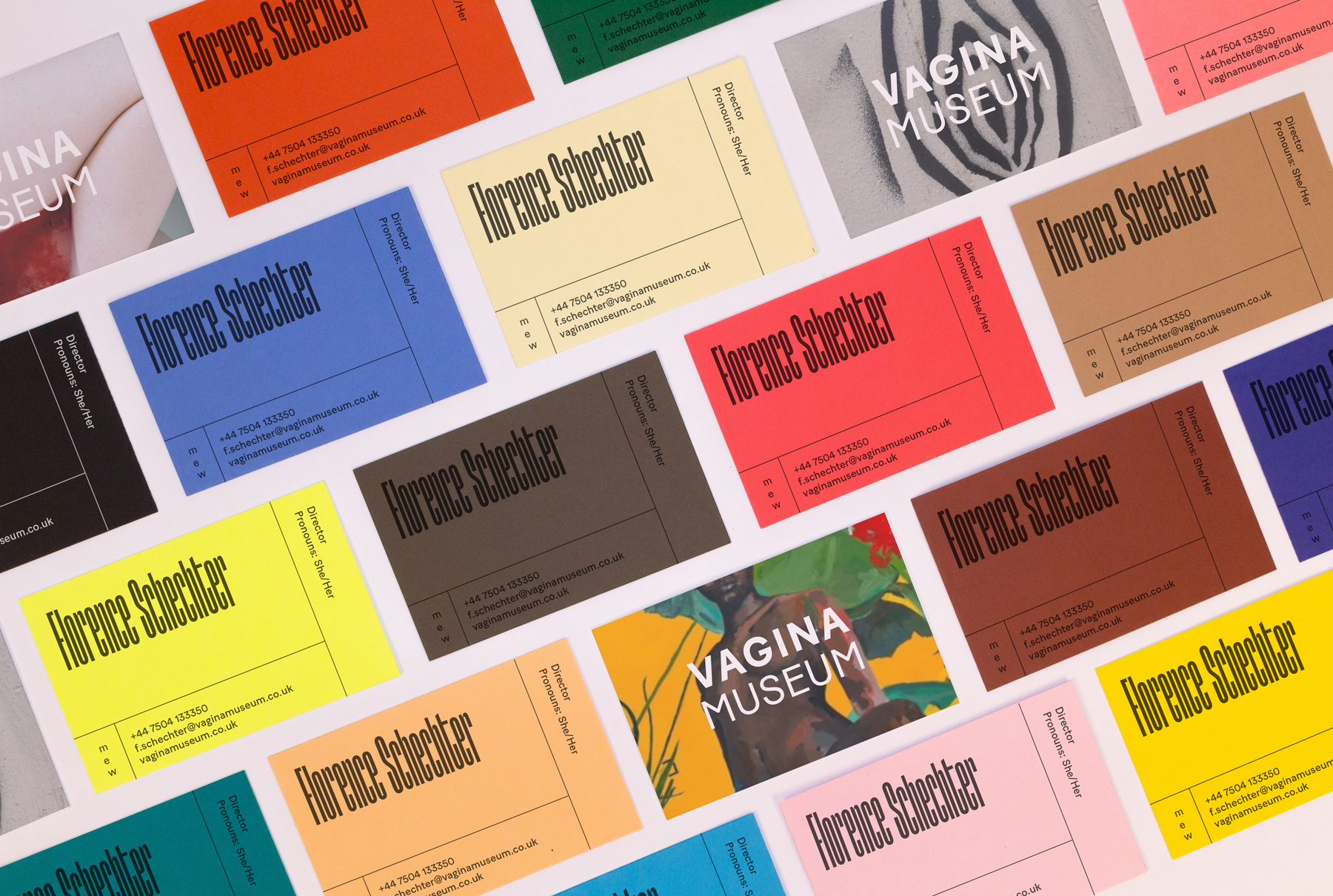
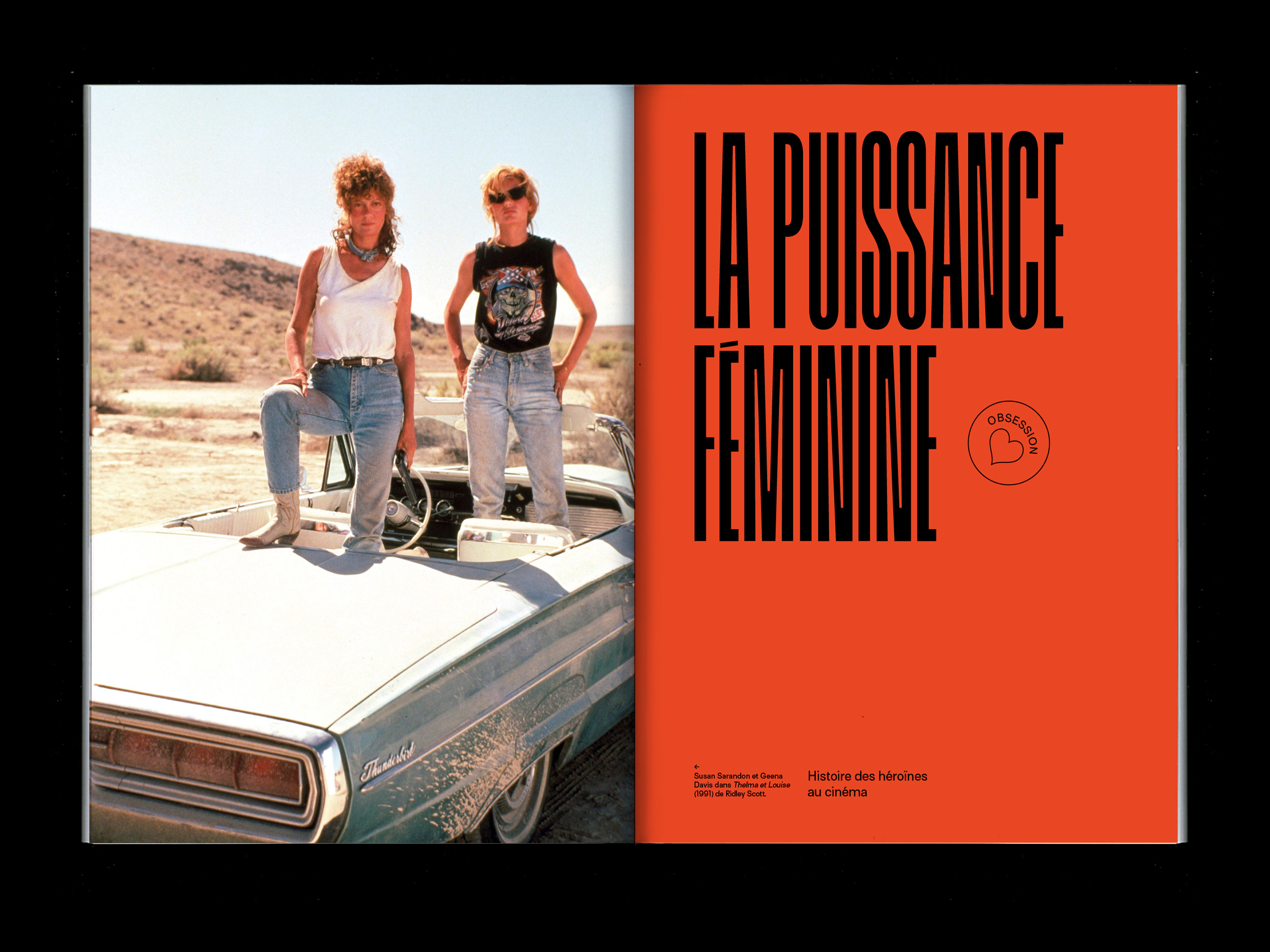
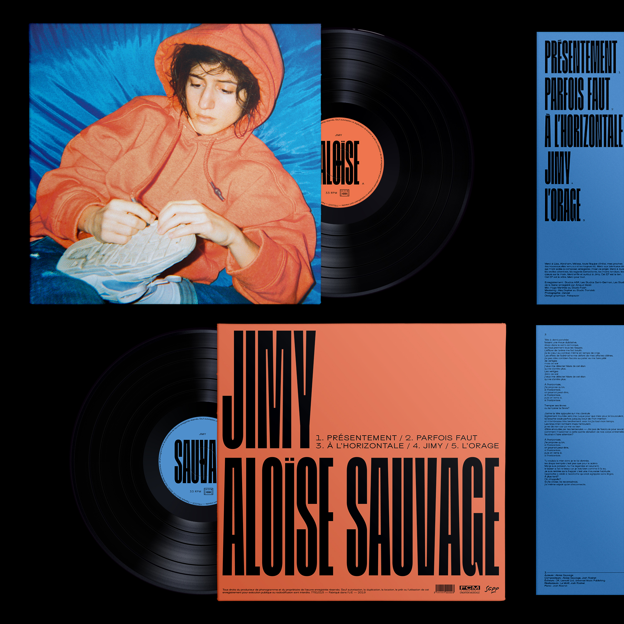
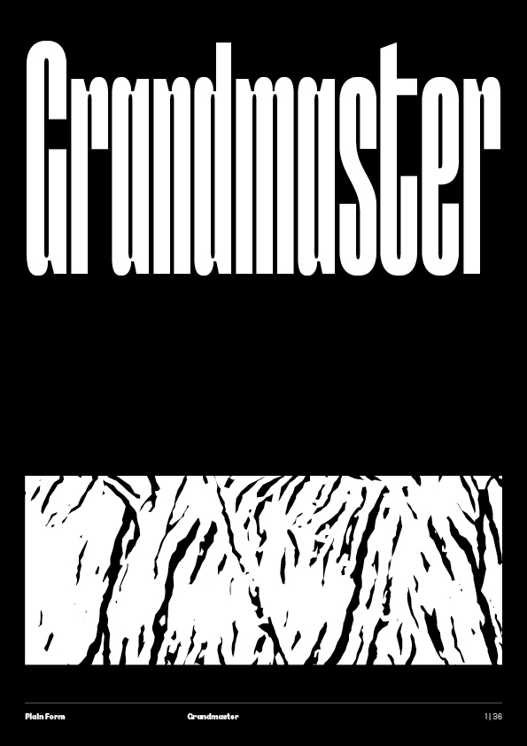
Built like a freestyle over a regular beat, the very condensed Grandmaster explores the border between text and abstraction. The extremely vertical structure, the regularity of its shapes and counter-shapes make it an almost-kinetic titling typeface, perfect for any incisive editorial layout. If you lose yourself in its rhythm you can almost hear it: cutting, scratching, mixing.
10 styles
Grandmaster
Thin
Thin Italic
Light
Light Italic
Regular
Regular Italic
Bold
Bold Italic
Black
Black Italic
Information
Design
Lucas Descroix
Release year
2018Font formats
OTF, WOFF, WOFF2
Glyph count
ca. 660 glyphs
Coverage
Extended Latin
For more information on the character set and language coverage, please have a look at the PDF specimen.OpenType features
Dil
Alternate a (ss01)
Su
Alternate g (ss02)
Thin punctuation (ss03)
Alternate @ (ss04)
Small capitals (c2sc)
It's
Tabular figures (tnum)
Cut
Oldstyle figures (onum)
Fractions (frac)
