Informations

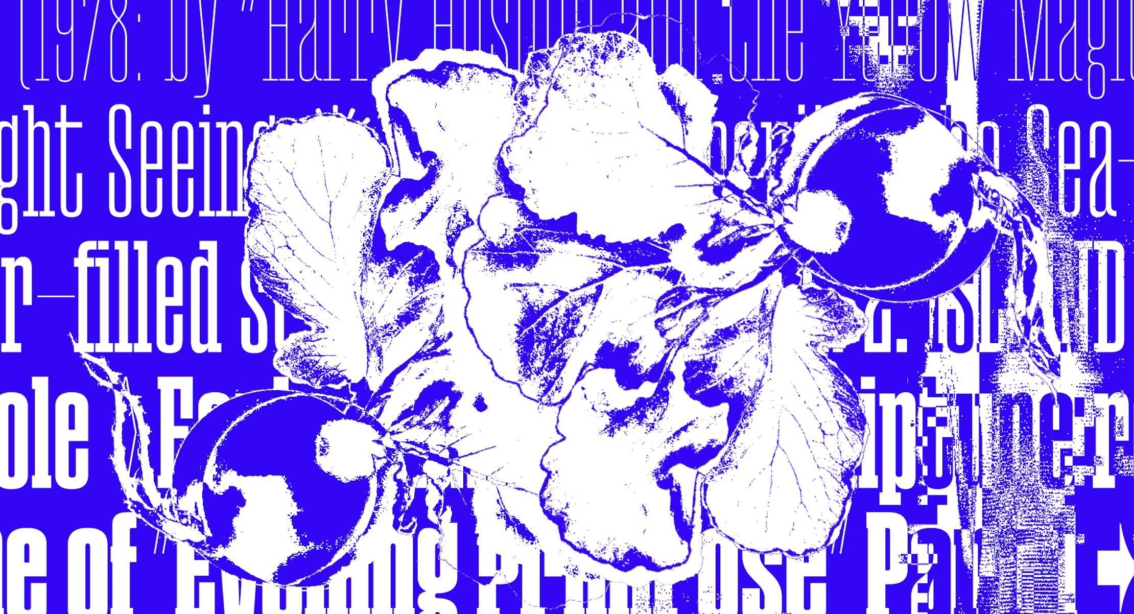
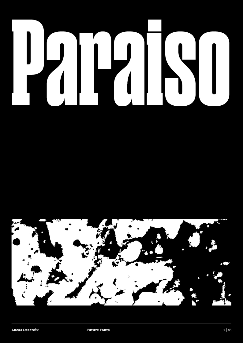
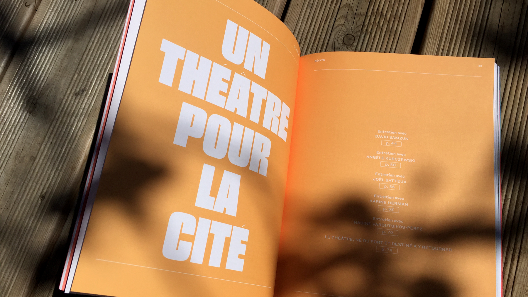
Paraiso is a condensed display typeface with a constructed feel. Although influenced by 19th and early-20th century wood faces, Paraiso's design is a fantasised reconstruction, straying away from nostalgia and precise historical references. Evoking a set of building cubes, this display typeface finds warmth in the regularity and somewhat comforting tightness of its rhythm.
The Paraiso family is coherent but not linear. It was designed as a limited but versatile palette for striking headlines or poster layouts, its blocky letterforms naturally calling for compact leading and big sizes.


Family

7 styles

Release

2022
→ PDF Specimen
→ Type testers
→ OpenType features
→ Additional information
→ Character set
→ In use

7 styles

Thin


Light


Regular


Bold


Heavy


Sans


Sans Italic


OpenType features

EarthEarth

Alternate a (ss01)

SingerSinger

Alternate g (ss02)
JulyJuly
Alternate J (ss03)
(&Moon*)(&Moon*)
Normal-weight punct. (ss04)
Alt#3Alt#3
Small capitals (c2sc / smcp)
(@NDE)(@NDE)
Case-sensitive forms (case)

2Disc2Disc

Ordinals (ordn)

Emu200Emu200

Superscript (sups)

Vol38Vol38

Subscript (subs)
2/92/9
Fractions (frac)
20192019
Tabular figures (tnum)
19481948
Oldstyle figures (onum)

Additional information

Design

Lucas Descroix

Font formats

OTF, WOFF, WOFF2

Glyph count

ca. 900 glyphs

Coverage

Extended Latin (incl. Vietnamese)

For more information on the character set and language coverage, please have a look at the PDF specimen.
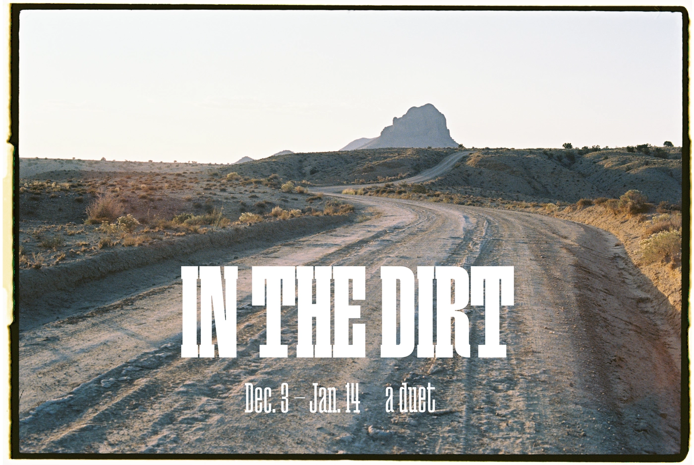
Character set


In use

‘In the Dirt’ exhibition
'Blueprints of Hope’, Octagon Gallery UCL
Le Théâtre, Récits de la Scène Nationale de Saint-Nazaire
‘Good Tape’ magazine, Issue 01