No matter our typographic inclinations, there is one thing we, letter enthusiasts, all share and that deep down reassures me: an intoxicating fascination with glyphs. One that can get us to contemplate for hours at a time, mesmerized, the curves of a g, a & or an a, as if to penetrate the magical machinery of a glyph’s existential condition, a drawing that surpasses itself to become a reading interface. One could easily attribute this to the fact that typography fans are somewhat nerds, but for me, this nebulous attraction is the mark of the aura of mystery that envelops letters. It is the indescribable feeling that writing is more than just a tool, but an invention so fertile, so powerful and so radical in its impact on the world that we can still easily comprehend why it was initially attributed to the gods. It is a tentacular mythological creature, so ancient that its origins merge with myth, and of which modern typography is merely the contemporary incarnation. I like to think that we all feel, deep down, that what lies behind an OTF file is of the same nature as what once lay behind hieroglyphics or the yet-undeciphered Linear A writing system. Today’s typefaces are bodies in which something greater is contained. Writing will outlive typography, as it will outlive the systems that shape it.
In Ridley Scott’s 1979 movie “Alien”, the spaceship Nostromo picks up a signal of potential extraterrestrial life and, after landing on an icy planet, its crew setts off on foot, searching for the source — unknowingly walking to their doom. What really strikes me is the spectacle of a group of people venturing into a nighttime frozen landscape. On this empty world, long since deserted by life, the unknown is supreme and the idea of stability an elusive dream. This was for me a moment of great empathy and an invitation for my mind to travel to untold lives of forgotten times, fantasizing a relationship with the world that today seems unthinkable: fully and deeply made of mysteries.
Needless to say, I am projecting. I am not an archaeologist, not a linguist, a historian nor an anthropologist. But I am filled with the idea that, in its lengthy history, before stabilizing and still in some proto-form, writing was for a long time the action of a person scrapping something onto a surface, trying to figure out some of these mysteries, longer actually than it has been a simple tool for language and memory. This poetic vision of the alphabet has led me to develop a particular feeling about the history of writing. That the letter A is built from a tilted ox’s head is not just a question of aesthetics or a fun fact. It compels me to regard writing, in its form, as inhabited by the world itself, as being a receptacle for the world’s mysteries, repeatedly hammered, squeezed and filtered and that the form we enjoy today just happens to be one of many possibilities, whose recipe we copy over and over again. If the mysteries of the world are endless, it seems to me that there is no reason for the shape of writing not to be.
Before delving into the history and theories of esotericism and the relationship between magic and writing, it was first Henri Michaux who made me appreciate the mysterious nature of alphabets. A 20th-century Belgian writer, poet and painter, Michaux was on a solitary quest to methodically approach language as free of dogma, by experimenting with texts and drawings. He painted numerous compositions of signs of multiple forms and densities, often in black and white and whose shapes were similar to those of letters, like an alphabet on a knife-edge. His work stands at the frontier of writing, as if Michaux was writing in unknown languages, with narratives forever unattainable.
When I encountered his work, I somehow saw myself in a mirror. Henri Michaux nurtured a double feeling towards languages and alphabets: on the one hand a form of insubordination to its authoritarianism and its structured nature, which he saw as a type of control, on the other a compelling, hypnotic attraction for what is still to be discovered. Michaux’s world is in many ways similar to the icy planet from “Alien”, where stability is an forever unattainable luxury, yet where the poet hopes to find the answers to questions he can’t put into words.
“Signs of the ten thousand ways of being in balance in this shifting world that laughs at adaptation. — Signs primarily to withdraw oneself from the trap of the language of others, built to work against you, like a well-adjusted roulette wheel that leaves you with only a few happy shots. — And ultimately the ruin and defeat that were inscribed there for you, as for everyone, in advance. — Signs not for turning back but for better ‘passing the line’ at each moment. — Signs not as one would copy but as one would pilot or, unconsciously charging ahead, as one would be piloted.” — Henri Michaux, Face aux verrous, 1967
It was with this mindset that I set out to design the typeface Michaux back in 2012, like an adventure, a personal expedition to the frontiers of writing in hope to find the answers to questions I couldn’t put into words.
For his experiments, Michaux would consume various psychedelic substances, including mescaline, under medical supervision. It was a way to allow himself to be overwhelmed by the experience, to no longer be entirely in control and, by extension, controlled. As for me, I replaced substances with chance and, using a simple computer program began by generating a thousand random signs, all of them made up of three mono-linear strokes, either straight or curved. This universe of shapes would become my laboratory for a while, where I would try and uncover potential letter candidates.
Back then, I wrote: “I enter the cave. It’s dark and as I crack a match to light my torch, I discover symbols. They were here long before me, quietly waiting for someone to come and look at them. I begin jotting them down in my notebook. There are thousands, perhaps millions of them, and I’ll never be able to record them all. I observe, I write, I scribble, I dodge, I point, I close my eyes, open them and close them again. I see, don’t want to see, I admire, worship, insult, accept and reject. In the end, I find what I’m looking for. How long have I been here? I’m getting tired. An eternity wouldn’t be enough to go through it all.”
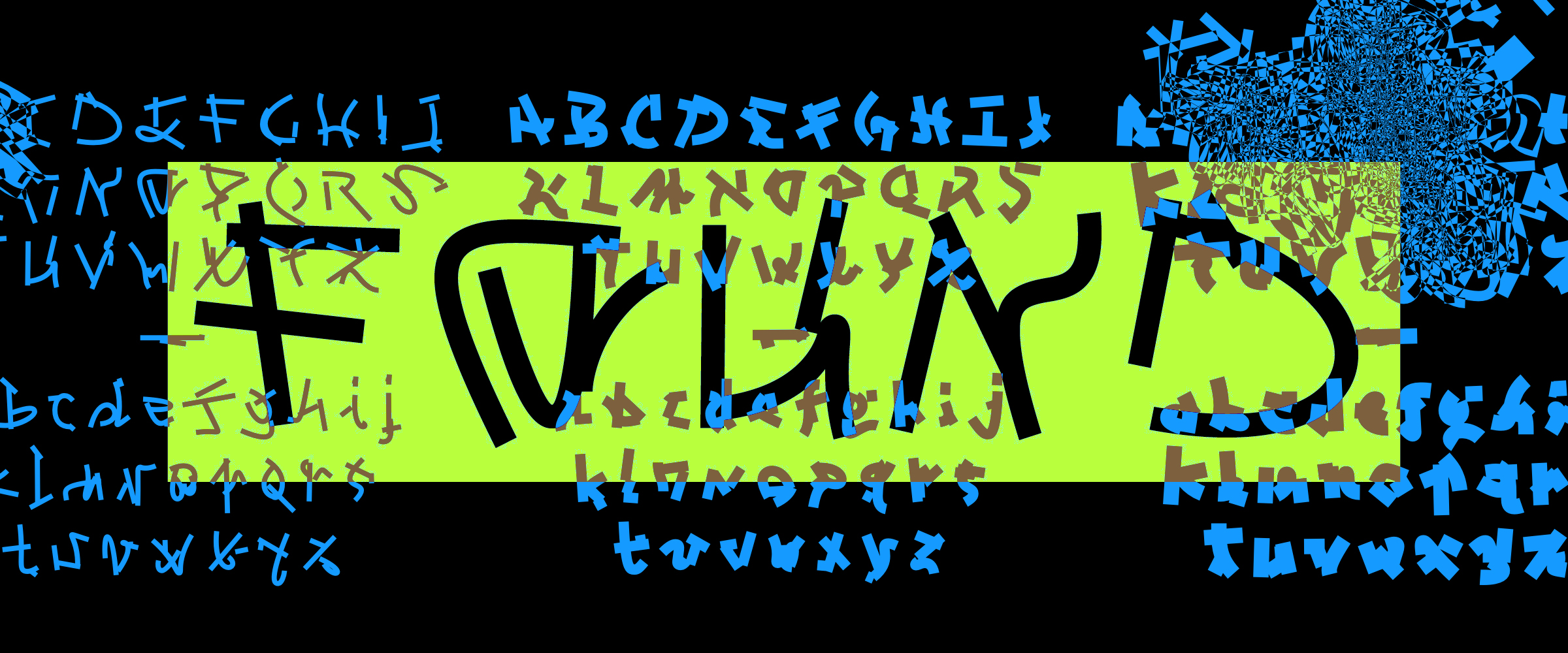
Selecting the most letter-like signs was no easy task. For the final, fully revised version of Michaux, released with Plain Form in early 2024, it was not a thousand but ten thousand signs that were generated. The folder, overflowing with PDF files of proto-glyphs, was like a sweat lodge in which I could not spend more than an hour or two at a time. The brain, trying its best to detect anything resembling letters, was considering each abstract symbol as a serious candidate, mentally twisting and mirroring it in all possible directions. It was fascinating to see how my mind worked in these moments. I would set myself the goal of finding a particular letter, say a lowercase g, and my whole perception of the signs would suddenly change. After countless hours of pacing through these landscapes of shapes, dozens of alternative choices for each letter, and the acceptation of the process as being fully subjective, a complete glyph-set slowly appeared. A glyph-set selected out of a wild jungle in which, fatally, I have missed signs that could have been somehow better, and for sure a glyph-set that would have been entirely different had someone else been in the driver’s seat.
From the very beginning, I was intending to create Michaux as a type family spanning over three weights: Light, Regular and Bold. As I was generating strokes rather than outlines, I was confident I could reuse the signs from the Regular, which I had worked on first, and simply adjust their thickness. But something happened that I guess I should have seen coming. The selected glyphs, whose legibility was already hanging by a thread, lost all logic as soon as I tried to tweak their weight. If type design is often about stability, consistency and robustness, Michaux is the very opposite. It is, despite its dynamic, confident appearance, fragility itself. A disappearing connection, an unfortunate overlap and a letter would fall back to its birth-state as a purely abstract sign. Extracting these glyphs from the boiling confines of legibility and bringing them in the world of room-temperature alphabets had made them highly unstable. It was therefore necessary to generate another ten thousand signs in Bold, ten thousand in Light and start the process all over again. Like a typographic Sisyphus, I patiently returned to my new sweat lodges in search of two new glyph-sets.
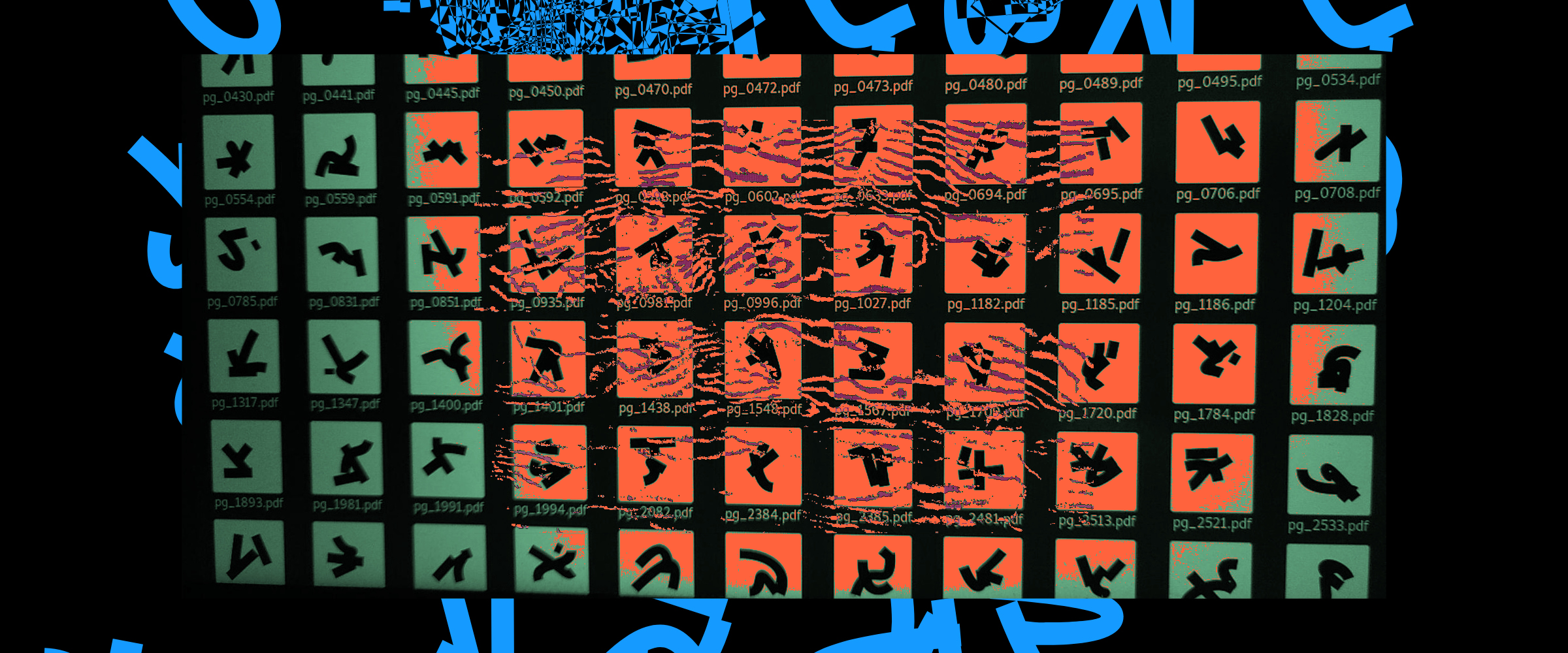
This method of creation is precisely what makes Michaux so distinctive. Not only do none of the glyphs share a common structure like it traditionally would in the Latin alphabet (for example the lowercase h, m and n), but this is also true between the weights; each sign is absolutely unique. The system is only held together by the rules of the generative process, the regularity in the amount of strokes and their thickness providing a sort of visual logic. Michaux carries the bare minimum to still be considered legible while keeping a foot in asemic writing. Calling this typeface “illegible” would be false, as it would overlook the very nature of the project, which is aimed precisely at crossing the boundary from the asemic to the seminal. In this process, the sign can’t help but retain marks of the carnivalesque world from which it emanated, devoid of x-heights, regularity, or even a family tree to support and justify its appearance.
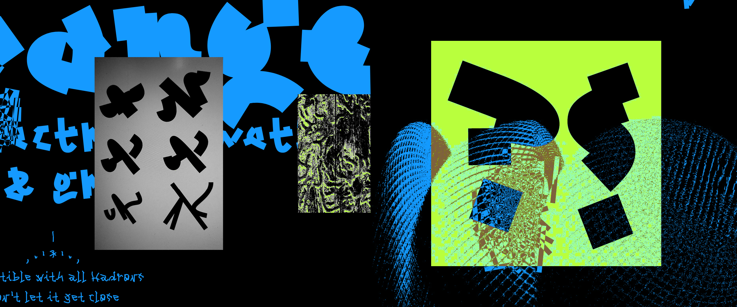
With the design of the type family Michaux, something became clear to me: I do not want to solve typographic questions, I want to create them. I want to make the mysteries of writing ever thicker. Just as science sometimes gives us the illusion of grasping the world in all its complexity, it seems to me that type design sometimes gives us an illusion of control. There are no answers and no need for them, only mysteries to indulge in.