Sometimes there are things you encounter but later cannot find any traces of anymore, yet they live in your head until you start doubting if you’ve made them up altogether. Little things, a blurry image, some words. It is the case for what I believe I have read in a printed document from a local theater, back when I was in high school. It said something along the lines of: “there is nothing more simple and more touching than a radish”. I’m using quotes here but I’m not sure if I even should.

There are two things I love about this sentence: its content, obviously, and the way I’ve been carrying it, probably changing it, twisting its meaning entirely, for all I know. But what I keep from it is great, isn’t it? Should I then even care about its lost origins? Shouldn’t I just enjoy the piece of wisdom it’s giving me? Because there isn’t, indeed, anything more simple or more touching than a radish. Its humble size, its purple-ish red skin — sometimes contrasted by the most marvellous white tip, the green of its leaves. And the shapes, the curves! Even the way it comes to be, just standing there “like it’s trying to prank some idiot into thinking this is how [it] grows”. Just brilliant.
![“like it’s trying to prank some idiot into thinking this is how [it] grows”](https://preview.redd.it/nin4n23qdy151.jpg?auto=webp&s=2d948a60bca89f6b8f1ff828736a5664ed2f2d0c)
The journey of Paraiso started with a teaching experience, an exercise I gave to a group of students and felt like doing myself. I was invited for a week-long type design initiation workshop in early 2021 and the starting point I chose, the source of inspiration, was something rather unserious: each student would have to create a display typeface based on a type of Pokémon. If you’re from a different generation or a different world, the only thing you need to know is this: Pokémon are little creatures and they come in various types, let’s say elements — think Fire, Water, and so on. Maybe you’ve seen David Jonathan Ross brilliantly attempting to classify his typefaces according to these same types. If not, well, you should.
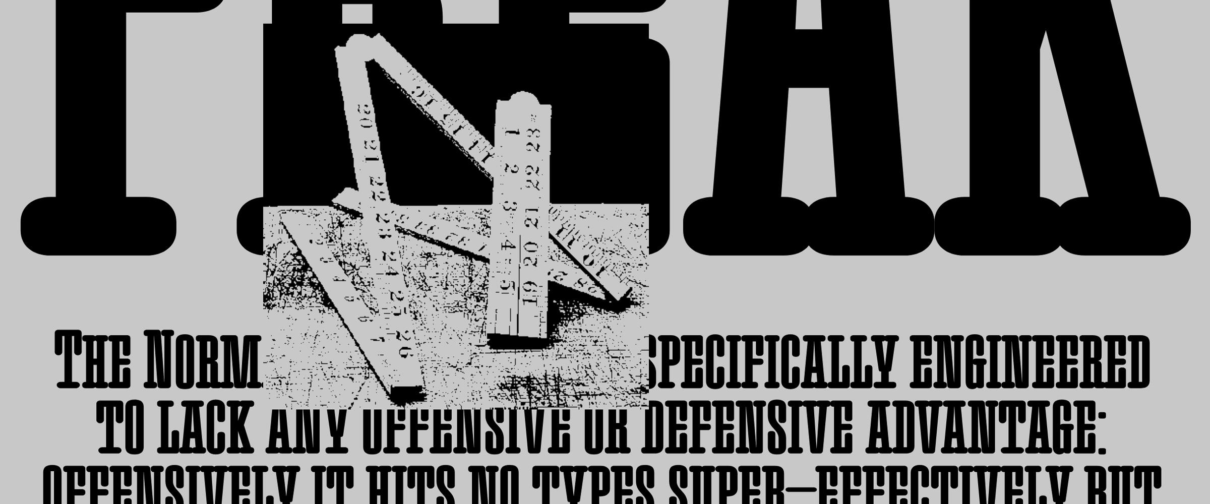
I tasked myself with the type called “Normal”, as it didn’t seem the most thrilling for students. And I started like I usually start everything, following my gut. Which this time, said “Maybe”. I imagined shapes that were part of my idea of normality — it could have been a radish and honestly I’m not sure the result would have been much different. But I somehow landed on bent material, metal and wood, like old-school chairs and radiators from a French café or something of the sort. And at the same time, a blurry vision of 19th and early-20th century type specimens, with huge words set in architectural slab letters.

So I went on combining the two, without looking at either. What I was going for was a non-nostalgic, fantasized reconstruction of those feelings. Normality isn’t too far from regularity and so I started building myself a sort of toolbox, or even more a construction game made out of a few blocks, with very simple shapes that I could repeat. The outcome of this first time-limited exercise was an all-caps slab with — don’t ask me why — rounded corners. But there was a sort of radical simplicity, just like that of a radish, that made me want to push it further. The game was set and I really wanted to play it.

This process, fueled by a boiling soup of images in my brain and free from any precise historical source, felt rather liberating. My visual vocabulary, like little pieces of bent pipes, was only allowing for limited structures and solutions. That made me naturally go for serif-less letters such as c and s, as well as awkwardly flat joints in v or w. The regularity of shapes and counter-shapes was also a pretty clear guide all along, wether when removing elements like the serif in the E’s middle section or exaggerating some to fill up the gaps, as in t or r.
Expanding Paraiso into various weights was also very enjoyable. Partly because of its constructed aspect, but also because my idea of a “fantasized reconstruction” pushed me into considering each instance of each letter separately, sometimes changing some details or even elements of structure from one cut to another. Serifs became naturally shorter as the weight increased and I had the simple — and touching — vision that they could be swallowed whole if I pushed it a little bit further.

Paraiso features five weights from the initial slab-serif design, accompanied by a single chunky Sans and its Italic counterpart. This odd choice for a family structure can be explained on different levels. First of all, it is something I like to do. Simple as that. Gathering typefaces under a single banner, the way I did it with Syne for example, is like mixing type design with a bit of font-pairing, the art of associating typefaces. It is taking a step towards the user, placing my expression not only in the way the letters look, but also how they will exist.
Paraiso Sans is a tight and heavy sans-serif typeface, probably owing its flat-top aspect to the title design of Katsuhiro Otomo’s ’Akira’. But despite their industrial feel, the letters are infused with discrete human-like details, like the bent leg of the R or the slightly asymmetrical middle section of the E. Space there is regular but also minimal, with compact structures for t and r, and almost-closed counters in letters like a or s.
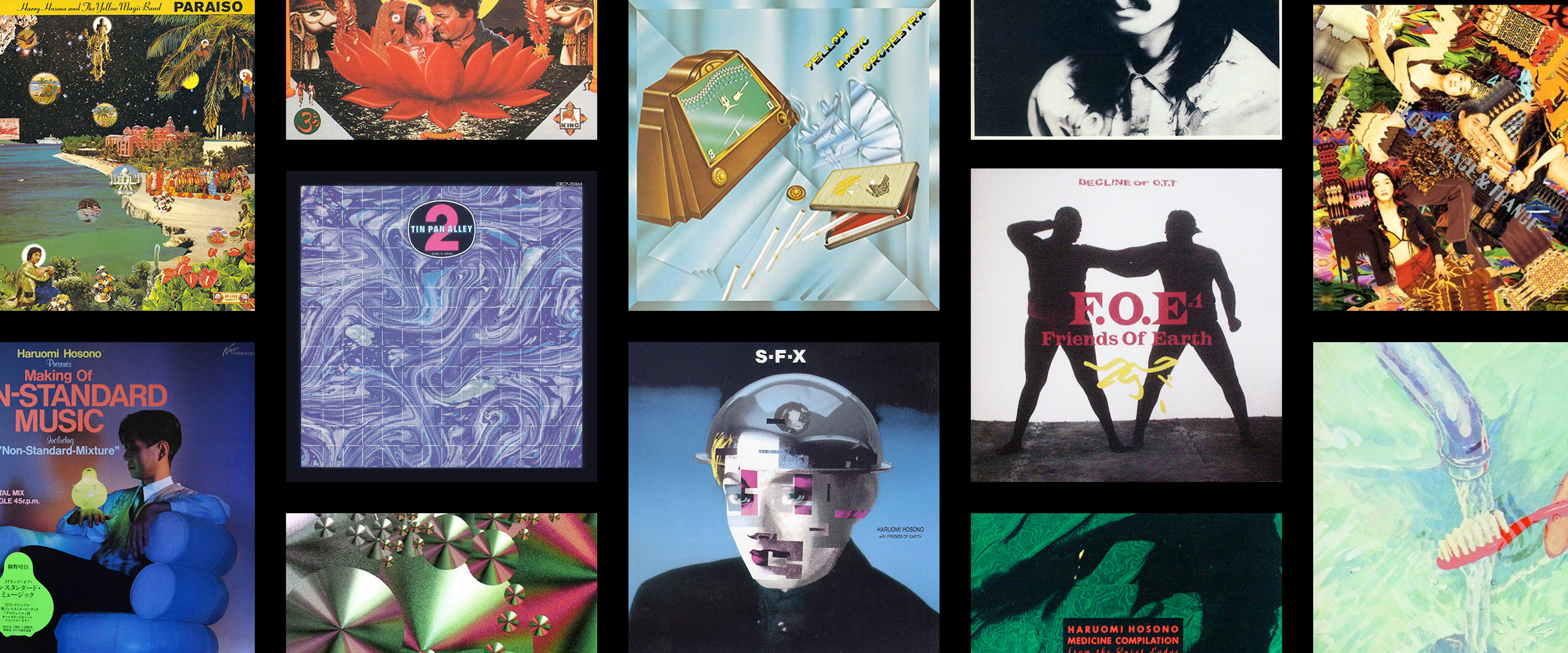
If I had to associate each of my designs with a specific music, this one would without a doubt go with Japanese composer Haruomi Hosono — for the music, but also the attitude. Hosono is a model in breaking grounds and hopping borders and he has a very interesting relationship to traditions, probably born from his upbringing in post-war Japan and the American occupation of his country. Along the years, he’s researched ways of blending influences and bridging gaps, for example between computer-heavy techno-pop and indigenous traditional music.
Looking into Hosono lead me to, amongst other things, an article about cultural reinterpretation of popular music and more specifically covers of American songs by Japanese artists. The author, Judy Yoneoka, defines various levels of modification and in-betweenness, including what she calls “generic maintenance”, “a conscious decision to abstain from culturalization processes in favor of retaining universality” — which somehow brought me back to the distance I chose to take from existing references, going instead for a feeling of “normality”. These thoughts aren’t very precise and I surely can’t say exactly how they’ve inspired the design of Paraiso. But they were there the whole time.
One way I like to build type families is with a graphic designer’s eye, often playing with contrast. Another — and the two can easily be combined — is by giving the whole family one radically similar attribute. In the case of Paraiso it’s the symbols and diacritic signs, who all share the same thin weight. This unexpected way to tie the family together is also a statement in making it display-first. Having a hairline accent on a bold letter is something I’m always happy to find on a book or a record cover, a little ingenious fantasy from the graphic designer. Making it the default in Paraiso is simply an homage to this practice.

Paraiso aspires to be a radish, simple and touching. And it was built the same way as my initial radish quote — remember? — as it brewed in my head, away from what initially inspired it, becoming its own thing entirely, a completely imagined yet strangely familiar object.