Every member of a family is the reflection of a family structure— and I am basing this on no science whatsoever. I myself am the youngest child of mine and I grew up looking up to a dynamic, trailblazing, albeit intense sister, prone to taking brave initiatives, working all sorts of student jobs and hitchhiking to all sorts of countries. A sister who always knows how to be present, regardless of the mood. That means knocking down doors to get where she needs to go but also meeting conflicts face-to-face. Me on the other hand, witnessing both the highs and the lows, I naturally gravitated towards a discreet and harmonizing way, maybe sometimes to a fault. I watched, learned and borrowed a whole lot, to develop in an altogether different direction. Petit Frère — which is French for “little brother” — did pretty much the same.
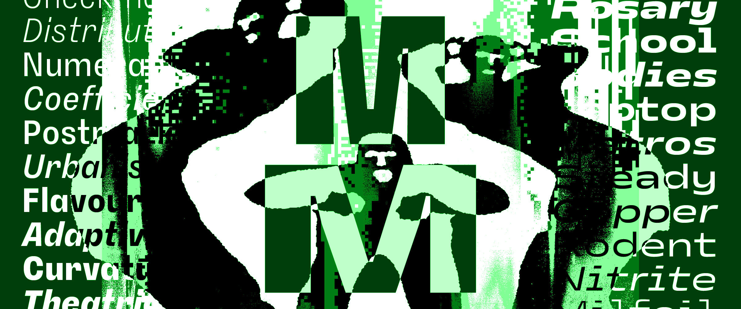
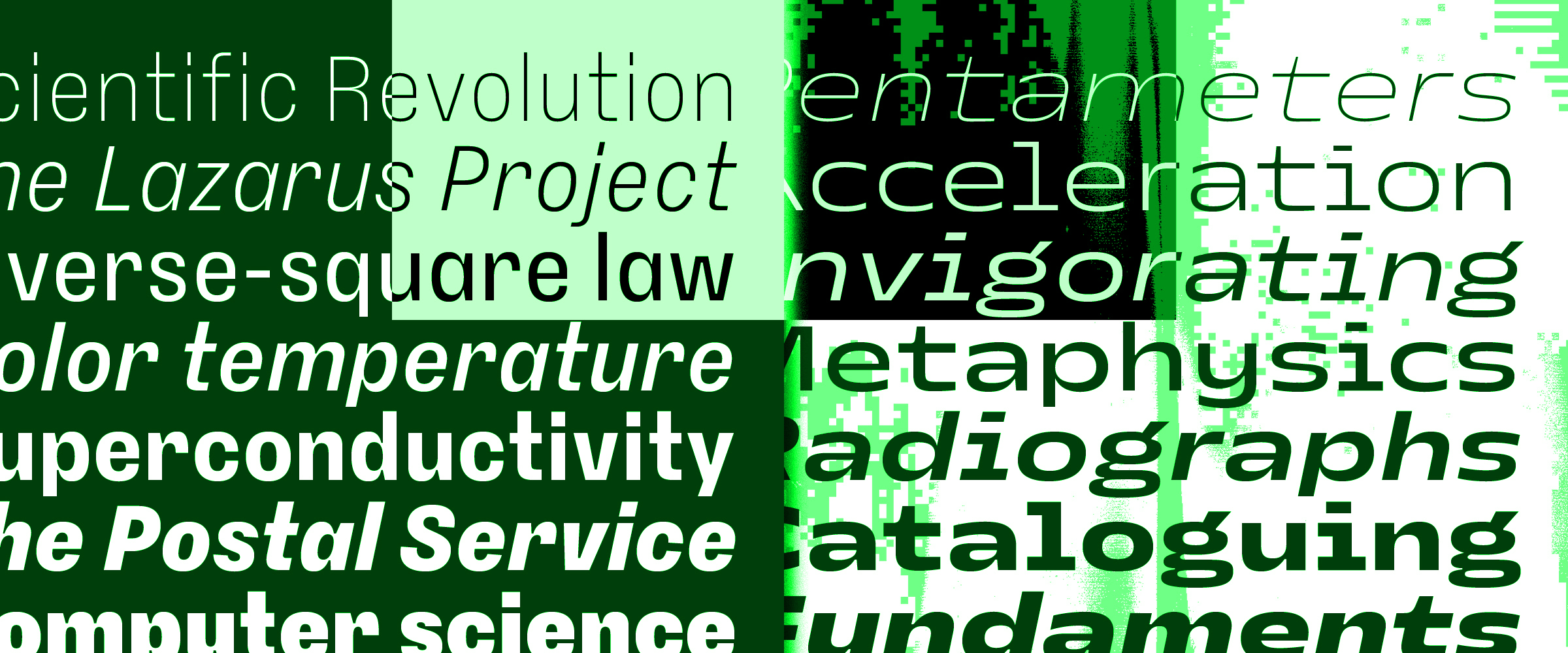
If traditional, dare I say “nuclear”, type families rely on some sort of shared DNA and perceivable consistency between their various styles, Petit Frère is more of the blended kind. The family consists of two widths, Narrow and Wide, each of them an interpretation of one of my display typefaces: namely Grandmaster and Nostra Sett. The condensed Grandmaster was my first ever release, joining The Designers Foundry’s catalog in February 2018. A few months later, a first version of the extended, monospaced Nostra followed as a work-in progress on the back then relatively new Future Fonts. Both designs are the product of a similar time in my life, with similar environment and visual tastes. In their own ways they are both sturdy and constructed, with details like ink-trap-ish joints and a peculiar weight distribution in letters like M, N or w.
Even though Grandmaster came in five weights, its starting point was the black weight which, considered together with Nostra, made it an exploration of the extremes, with thin, regular counter-shapes as a common denominator. Both designs presented challenges in dealing with space, whether too much of it or not enough — a rather identical carving exercise, practiced on two radically different blocks. But as much as these similarities now seem obvious, both in their look and intent, I was at the time very much unaware of them, simply designing what felt like two very different typefaces, thus making different choices when sometimes facing the exact same situations.
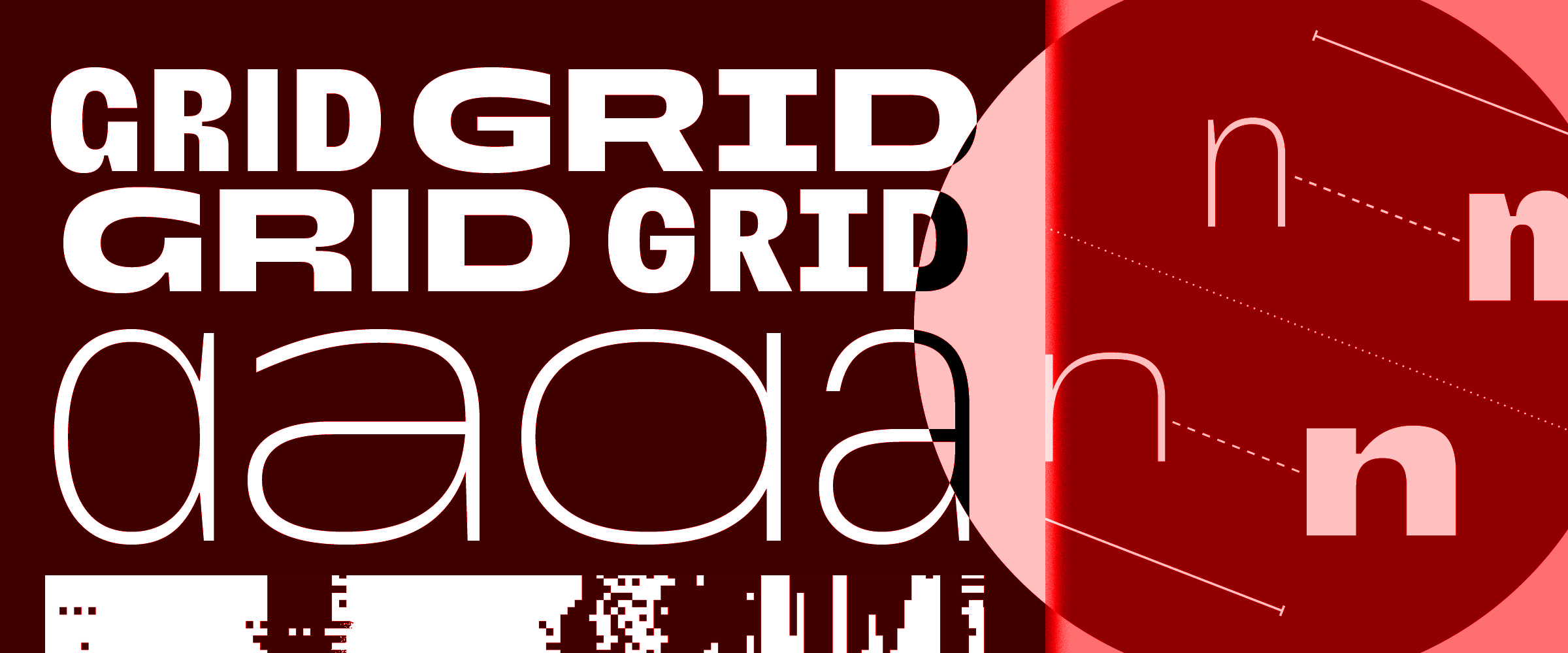
Born from a lack of space due to its radically condensed structure, Grandmaster shows a somewhat straightforward, geometric approach, with single-bowl a and g, a vertical-legged R or the rather closed, upright apertures in letters like c, e and s. With Nostra Sett, on the other hand, the difficulty was not to fit a content but fill a container and although there were added elements like the monospace width and quasi-absence of ascenders and descenders, there was much more freedom, which translated into humanist structures and a higher amount of details. Needing to stretch a far as possible, the apertures in letters like c, e and s became almost fully horizontal while stately serifs were added to narrow letters like i or l.
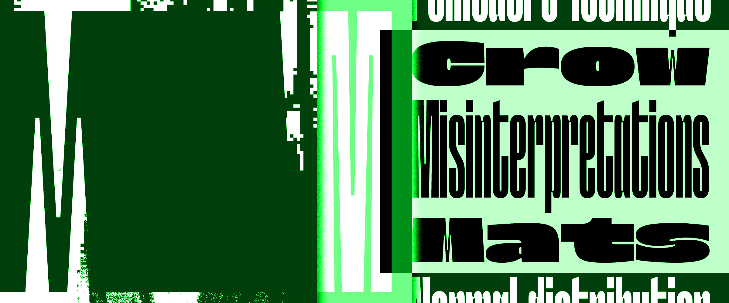
I love the idea of type being a system, each design presenting a set of rules, and there is a real thrill in exploring what these could become, whether by expanding a glyph-set or trying out new stylistic variations — to go from a set of shapes to an ecosystem. This led, over the years, to several highly unsatisfactory attempts at pulling both Grandmaster and Nostra into new directions, often with new widths or optical sizes. Then, one day that I was revisiting forgotten folders, the similarities in these attempts became apparent and it seemed evident to try and bridge the gap between the two existing families, like two cohabitating partners bringing into a new home the offsprings from past relationships.
If you know some of my work, you know that I enjoy going all out, for example flirting with illegibility, but more often than not what really gets me going is the idea of twisting habits. Not per se thinking outside the box but more like repurposing some of the box’s walls. Or even using the box, just not as the intended storage device but perhaps as a ladder, a drumming kit or an oversized goblet. With Petit Frère, it is quite obviously the idea of family that is questioned, but not in a punky, gather-ish way like in Syne. Petit Frère relies on both traditions and contemporary trends, a nod to flexible sans-serif systems, stretched and squeezed, starved and overfed as to fit any environment, quench any type of thirst. Like some before — Norbert, Druk or the initial release of Mars, to name a few that I greatly admire — Petit Frère offers no middle point, no norm, leaving users with nothing but the illusion of a large family structure, a phantom itch on a missing limb. And if many elements in their designs differ, it felt important to give them the opportunity to look alike when needed, like falling back to old roles and habits at family reunions. Hidden in the OpenType features are a set of alternates that allow the user to easily switch between Narrow- and Wide-specific structures.
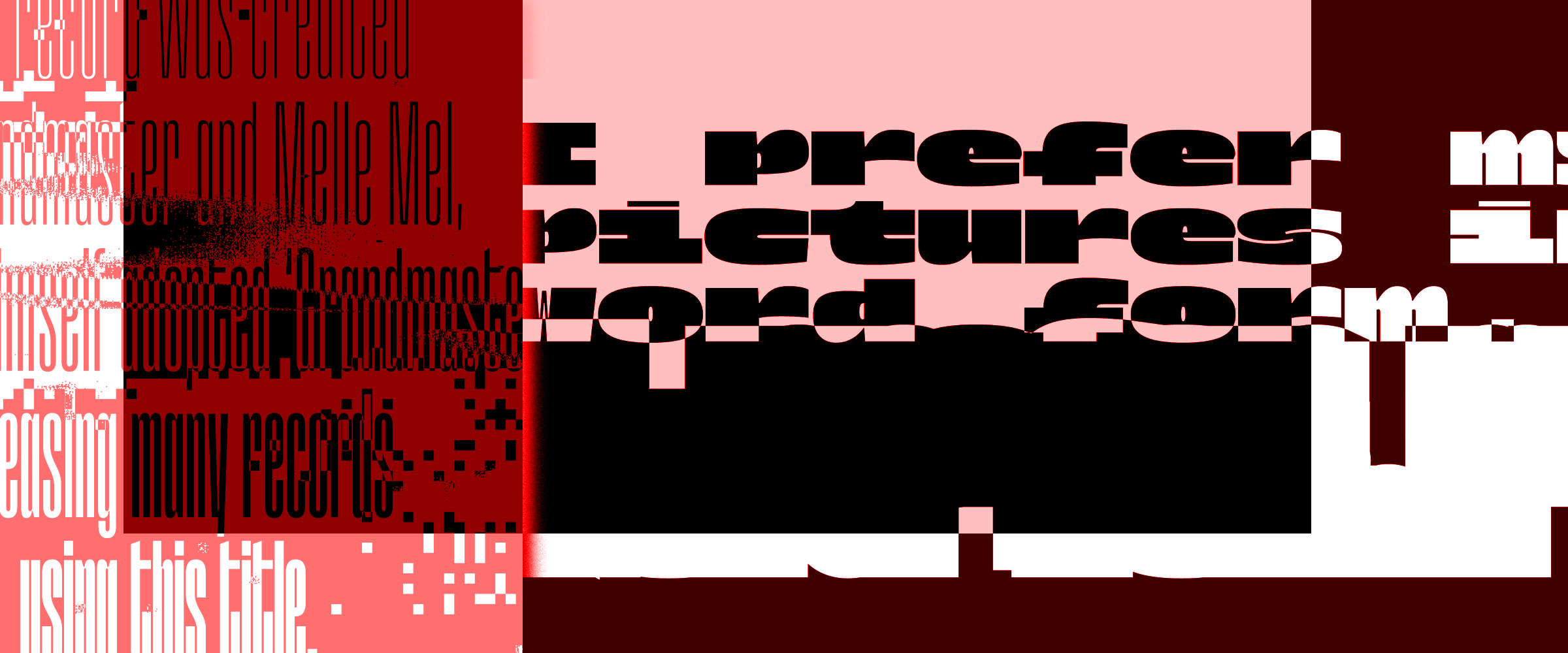
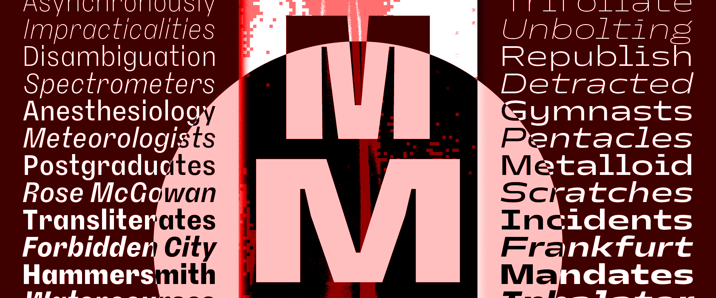
Petit Frère is perhaps the most conventional typeface in the catalog, at least visually. Two takes on the ubiquitous sans-serif genre meant to complement each other, they retain some of the unusual contrast found in Grandmaster and Nostra Sett, particularly in diagonal elements, but I actually spent most of my time trying to tone these down. I did not want Petit Frère to be an “M-formula” caricature of its sources of inspiration, nor a logical adaptation where I would simply have applied existing recipes on the x-height, apertures and all these design elements that need transforming when crafting optical sizes. The Wide and Narrow companions were always meant to be able to stand on their own, exist without a reference, inherit quirks and mimics from their ancestors as well as the freedom to invent themselves a new path. And when Grandmaster was accompanied through its design process by the sound of early hip-hop artists, Petit Frère bears the name of an iconic track from French rap band IAM, whose members learned a lot from the US scene before crafting their own style.
Even if rough sketches of Petit Frère already existed for a few years, what really made me want to finish and publish it was the prospect of launching Plain Form. When I was, before that, always distributing and communicating on existing platforms that gave a frame to my mostly display typefaces, I would now have to set a varied content, from articles to technical details and even legal terms. And although I saw typefaces like Grandmaster or Nostra perform well in all sorts of situations, I doubted they would be up for this job. I needed a more quiet typeface, a design that carried what I wanted Plain Form to be, without the need to be set in huge size, without giving readers incurable headaches after more than a couple of words. And, besides this practical need for a sort of interface-friendly design, I liked the idea of offering a more humble side-kick, to potentially be used alongside some of the louder typefaces from the catalog — something that James Edmondson expressed with Compadre and that I remember finding both ingenious and somehow touching.
Plain Form launched in October of 2022, quite the busy year for me, moving countries while setting up a type foundry, from writing license documents to developing the website and of course designing new typefaces that would be part of the initial roster. This could only work with compromises, one of which was to put aside Petit Frère’s italic counterpart. I managed to do without for the foundry’s communication and people who have licensed the typeface since its release seem to have done so as well. However, Petit Frère was always meant to wear the utilitarian cap around here and thus remained incomplete. After the launch, I felt more like having fun with my new structure, working on new releases and printed good, than the less-exciting task of slanting an existing design. So I waited until 2024, when the prospect of celebrating the foundry’s second anniversary gave me the energy to solve some open cases, to conclude what was left unfinished. With this new update, bringing the family to 28 styles, Petit Frère attains its majority, finally standing strong and whole.
What I like about Petit Frère is that nobody needs to know why it’s special. It can live a full life, serve many purposes thanks to its generous palette of diacritics and alternates, without having to explain where it comes from. But then one day you might accidentally meet its family and things will fall into place. I find beauty in these subtleties, in the many ways one can find inspiration from in type design, in the various shapes a type system can take. And if my sister and I are two distinct beings, not too far from sounding opposite on paper, I find fascinating that we belong together and that what similarities we share are somewhat deeper and more diverse than if we were simply wearing identical clothes and haircuts — although I’d really love to see that. Petit Frère is all about restraint, a balance of inheritance and individuality, ordinary members of an uncommon, blended family.