
It is very difficult to get out of one's own conditioning. Evidence is by nature indiscernible; it doesn't stand out against the backdrop of our millisecond-by-millisecond experience of the world. Writing — and by extension typography, the object that performs it — is no exception to such conditioning. On the contrary, norms are at the very root of what makes it operative. An arrangement of clues that activate in us the cultural object of “writing”, with the goal of transmitting a memory, raising worlds, cutting into the reader's thoughts.
It is hardly surprising, then, that given these foundations, the typographic technique has pursued a similar course of production for several hundred years, with great reverence towards tradition and the rules that constitute it, even turning certain ways of thinking into evidences. This text proposes to blindly navigate through one of these evidences: the concept of legibility and, even more so, its opposite. The idea is not to make a mere apology for illegibility in the name of our fondness for experimental theories and processes, but we find it regrettable that the label “experimental” is so often used to refer to letters that are difficult to read, just as we find it regrettable that illegibility is, by default, perceived as a negative attribute.
Legibility is of course what makes typography operative, but it is in itself neither good nor bad, merely a spectrum on which we, as readers, are able to navigate with greater ease than type designers generally seem willing to accept. What is certain, however, is that the notion of legibility as usually employed is a linguistic misuse, unconsciously tainting the field. As if designers weren't really aiming for legibility, but a kind of ultra-legibility, not the presence of meaning, but its instant evidence. As for us, we have decided to embrace the strange appeal of illegibility — not negative, but mysterious and rich with the promise of adventure. And we strive to untangle its threads, to make our way through the uncharted territories in which we like to lose ourselves.
We are pretty good at reading. Generally speaking, we acquire impressive flexibility in letter recognition at a very early age, with respect to a wide variety of handwritten forms and hostile reading environments: very small, very distant, very fast. Within this ecosystem, typefaces designed to be “ultra legible” often share a number of qualities, such as a homogeneous mass or an open structure. While not absolutely necessary for the activation of the reading process, they can provide, in a given time and cultural environment, the most comfortable vessel for content on its way to our neurons. However, three sticks lying parallel on the ground will be enough to conjure up the letter E, and a smudge with a floating spot on top, an i. Every day, we recognize letters dressed in different costumes, like an artificial intelligence program being fed an infinite stream of input, and our notion of “what an E looks like” becomes increasingly abstract and malleable in the process. More diversity for a more undefinable common denominator, for, in turn, greater potential for diversity: a retroactive loop.
Experimentation sometimes resembles walking in the dark, guided by hypotheses like hands stretched out blindly, with the hope of feeling under our fingers either the wall or the light switch. For us, the way we try to function when doing formal research, and in doing so, feed the loop, is perhaps even more like tossing around lanterns, each one lighting up a small area in an ocean of night. Tossing one right at our feet, over and over again, would be one way of getting around relatively safely. Tossing several far away and in random directions might get us nowhere, but we might also stumble across something unexpected, new and fun.

In addition to being good at recognizing letters, it would seem that the brain is actively looking for them. We all know the phenomenon of seeing faces everywhere - in tree trunks, on cars, on a slice of toast. It is thought to be due to the fact that faces are what give our brains the most intense stimuli. From the moment we are born, we seek out human faces because they provide connection, whether comfort or threat, and convey information. Likewise, in the vast world of non-representational signs, letters are easily what stimulate us the most, probably before we can even read them. They contain stories, advice and news. It is only logical, then, that our brains should seek them out whenever shapes appear. Texts that are difficult to decipher can exert an even deeper fascination, as we sense the existence of an element of knowledge without being able to fully grasp it, just like a melody whose ending we cannot recall is more likely to haunt us as it remains unresolved.
The difference between a sign and a letter is as hard to identify as the one between a living being and an inanimate object. If there is such a thing as a soul, 21 grams of je-ne-sais-quoi, it is probably what gives letters their magic. An unknown powder fallen from the sky, a spell cast in a forgotten language, and suddenly an assortment of abstract shapes starts to carry a meaning, a content, a culture. Preserving songs and stories in stone, spreading them on paper and screen, they are the link between continents, between generations. But just as easily as they were born, they can vanish. An unwelcome stroke, an obstructed counter-shape or a violent collision with a neighbor can reduce these mighty letters to indecipherable masses. What they need to survive is not necessarily a clean look and a plain outline in a standardized system, but merely a few hints of the role they play. Three horizontal lines will always make an E.
“Believers in magic, or magicians, they will often say that you should use barbarous names. What they mean is that you should make your spells in language that you don’t personally understand. […] When we’re using languages that we don’t understand, our mind goes all over the place.”
— Alan Moore, BBC Masterclass, 2022
Our brains develop through the organization of meaningless signals, transforming them into patterns that enable us to function with remarkable efficiency. Similarly, through our upbringing, we build up a relationship with language made up of rules, so unconsciously acquired that they seem almost natural. In 2006, a study by the University of Liverpool found that when some twenty participants were assigned to read Shakespeare, their brains seemed to respond precisely as the author introduced linguistic twists. By using a noun as a verb, for example, “he godded me”, Shakespeare replaces a crystal-clear communication of meaning with a compelling puzzle. Language does indeed need conventions to function, to convey information, but its boundaries are bursting with potential inventions ready to transcend meaning. This capacity of language to have such a powerful effect on us when it strays from the usual tracks plays a significant role in mystical practices for achieving altered states of consciousness. In the most extreme cases, we speak of glossolalia, “the act of speaking or praying aloud in a language having the appearance of a foreign tongue, unknown to the person speaking, or in a sequence of incomprehensible syllables.”
By going against nature, by forcing ourselves to do things beyond the ordinary, beyond logic, we confound the conscious mind and stimulate the unconscious into trance-like states. Floating between the “senseless” and the system, developing a Shakespearian practice, for oneself. The same could be said for the form of language itself. If typefaces operating at the edge of legibility exert a curious attraction on us, it might be because, in a certain way, they stand in clear contrast to the evidence embedded in our subconscious. They are both known and unknown. They invite us to walk along reading paths, as if on the edge of a cliff whose nearby abyss represents the absence of meaning. In standardized typographic styles, the reading process is comfortable but unsurprising. In unsettling styles, it turns into a survival game whose unexpected nature fills us with adrenalin.
If we choose to jump off the reading cliff toward the “void of meaning”, we fall into asemic writing, the glossolalic equivalent of the solid form of language. In this art form, people explore writing systems detached from any semantic content. Typographic culture today leaves little room for abstraction. Its usefulness is not theorized, and it is at best seen as an aesthetic experience, whereas it would allow us, for a moment, to wander the steppes of non-codified systems, to find what we would naturally never have gone towards, and why not even learn from these escapades, and make Shakespearean typography, active and surprising in its relationship with meaning.
“There are many reasons why someone may be attracted to illegible typography, as it can evoke a range of emotions and experiences. Some people may find the raw, unpolished look of illegible typography to be liberating and cathartic, as it can challenge preconceived notions of what letters should look like. Others may be drawn to the experimental and avant-garde nature of illegible typography, which pushes boundaries and defies genre conventions. Additionally, some people may enjoy the feeling of being enveloped in a wall of shapes, which can be both overwhelming and immersive.
There is a certain kind of ’extremophile’ type lover who seeks out letterforms purely for the harshness and intensity.”
— Excerpt from the thread “What attracts someone to noise (music)?” on Quora, where music-related terms have been replaced by others from the field of typography

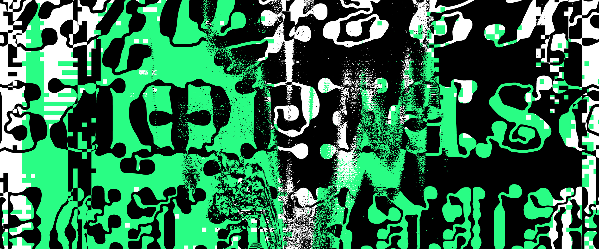
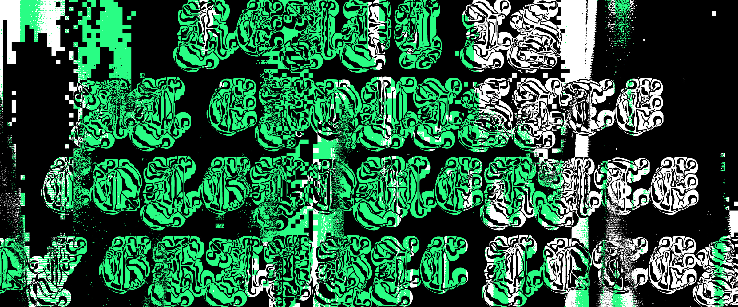
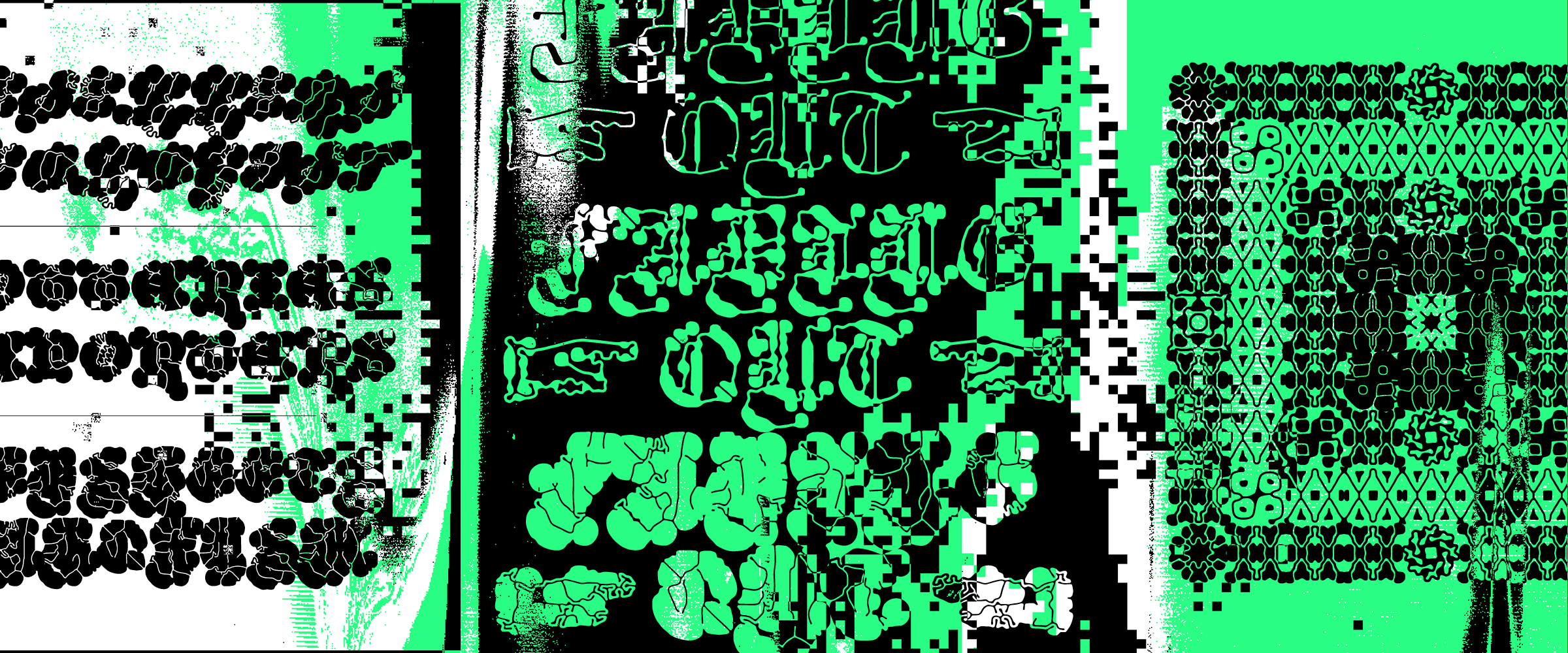
Overflowing landscapes of black and white surfaces, an ode to unproductive tasks, Ready bears a resolutely utilitarian name, evoking either a sans serif typeface for interface design or a font intended for immersive reading. Call it cynicism — or wishful thinking. But the name also refers to the tools that contributed to its creation and gave it its distinctive look, reaction-diffusion algorithms: one of the various stages involved in going from a vague intuition to a collection of font files, through various kinds of filters and transformation processes.
They say that necessity is mother of invention, and this was certainly the initial spark that led to the creation of Ready. The need to create a hierarchy of text with limited possibilities, back in the days of metal type, when the concepts of scaling and copy-paste were still far from existing. The result was titles printed in italic, all in capitals, often with lots of spacing between the letters. As if to say “oh, you want to know what this book is about? Work it out for yourself.” A visual treatment, a graphic design choice so to speak, that requires the reader to slow down by momentarily transforming text into architecture, moving slightly away from legibility in favour of visibility. A more contemporary example, and one that may already be a tribute to these historical practices, is the cover of Œuvres by Gérard de Nerval, published in 1952 by the Club français du livre; a complex script typeface, reminiscent of master calligraphers or interpretations such as Excoffon's Diane, used in capital letters, create an almost hypnotic pattern - while ultimately poorly delivering the book's practical information. But isn't it fascinating?
To encapsulate and, why not, exaggerate and condense this feeling in contemporary letterforms, we started by looking to the past. This sort of homage to complex forms began by seeking out examples, moments when exuberant styles took priority over a purely practical objective. Knowing that we wanted to integrate semi-generative scripts into the design process, it seemed interesting, and amusing, to revisit historical forms. Three directions were chosen - Blackletter, Lombardic and Script - that conveyed the appropriate feeling. Three calligraphic models of which we tried to collect a good number of instances in order to create new synthetic renditions, rather than accurate replicas. And, as a nod to those all-caps titles, Ready exists only in capitals; no choice but to scream. In many ways, it is a process not unlike preparing a concentrated juice, a flavour-packed broth, a consommé, if you will.
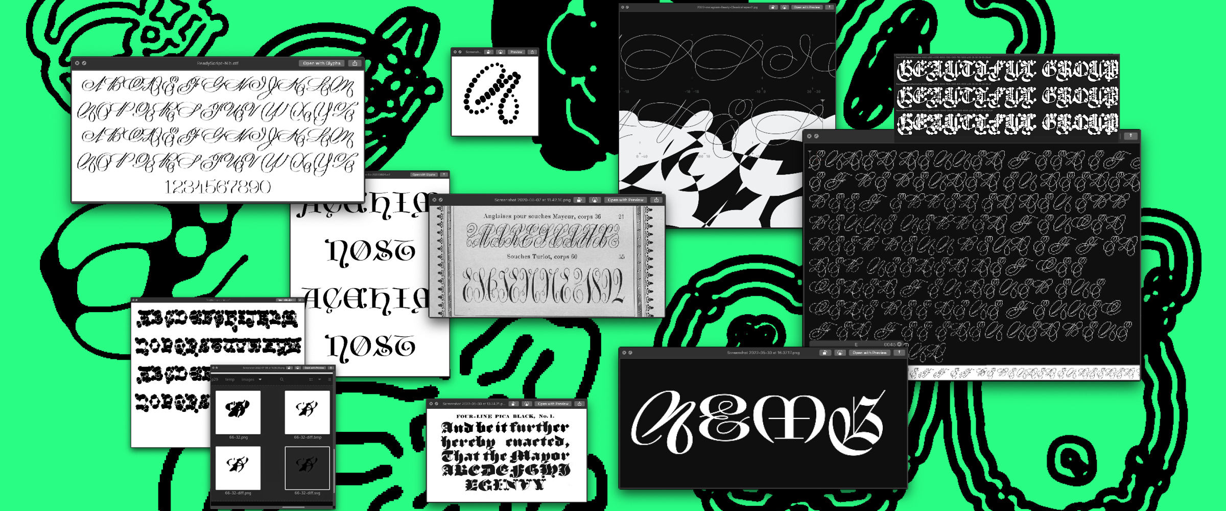
Adopting the method proposed by Paul Barnes in the design of Marian, we made these historical forms our own, by applying the “filter” of drawing what is referred to as a skeleton. In doing so, we not only distanced ourselves from the sources, but took the first step towards building a coherent family of typefaces, with all three styles receiving a similar radical treatment. We then fleshed out these skeletons by applying a digital nib, bringing even more distance and coherence to the family, as well as more food for the flesh-eating bacteria that is reaction-diffusion.
Such algorithms are not new, and have been relatively popular in the graphic design field over the past few years, notabley with Ivan Murit's TexTuring software. It was with his collaboration that Production Type developed Gothic Lab, a titling typeface using reaction-diffusion patterns within sans serif letters. As for us, our intention was not to confine these bizarre shapes to a conventional contour, but to expose the complete glyphs to the process of metamorphosis, and use, amongst other things, the algorithms’ tendency to increase the boldness of a design with each iteration as a way of thickening it to the point of illegibility.
From this point on, the process proved somewhat laborious for two reasons. First of all, the reaction-diffusion parameters are quite intangible and the possibilities almost infinite. The slightest tweak in just one of the many parameters and the result changes drastically. How do you then figure out where the treasure lies? Which parameters are the most relevant? Second problem: each test was conducted on at least all twenty-six capital letters and ten figures, in all three family variations. Without this, how can we be assured of consistency, and the interest of the parameters for the typeface as a whole? The back-and-forth between testing the algorithm and adjusting the base skeleton begins. Thankfully, the work done on Jester, a typeface published by Grifi the year before, provided a solid technical foundation: scripts to deconstruct an OTF file into images, apply the desired reaction-diffusion parameters, trace them automatically and reintegrate them into a new font file. Each attempt, with PNG input images of sufficient quality for optimal results, takes a while.
The final export of the entire family, this time including all glyphs in nine different styles, amounting to almost three thousand four hundred signs, took a little over forty-eight hours to compute.

Ready is not an invented language. It is not even an illegible typeface. But it borrows from these things, the feeling they inspire and the reasons they compel us, while at the same time trying to bridge some kind of a gap. It is an experimental typeface, both in the processes that brought it to life, and the logics that bring it together as a family. Ready is not ascemic writing, but a ready-to-wear translation that could be found in a store because it contains, at the least, the promise of utility. Ready would be like micro-dosing glossolalia, just what you need to take the edge off, to rid yourself of what you think has to be, and accept what is.