Old things are fascinating: a stone column in ancient Rome, a thousand-year old tree, a shopping mall from the early eighties. They’re fascinating because they are a direct window into a time long gone, a fixed point around which to better imagine how landscapes, cities or people were. But more than the relic of a precise moment, I find old things to be magical because of how they evolved, oh-so slowly shaped by a myriad of very small actions, whether from water, wind, passing pedestrians on a solid stone step. Each of those actions tells an unseen story, yet each drop counts, because without them erosion can’t happen. That is why, although I very much understand a desire to archive and protect as is, I always want to use even my most precious belongings — books, ceramics and others. Not that I want to damage them in any way, I just think that every slight touch adds to their unique story and value.
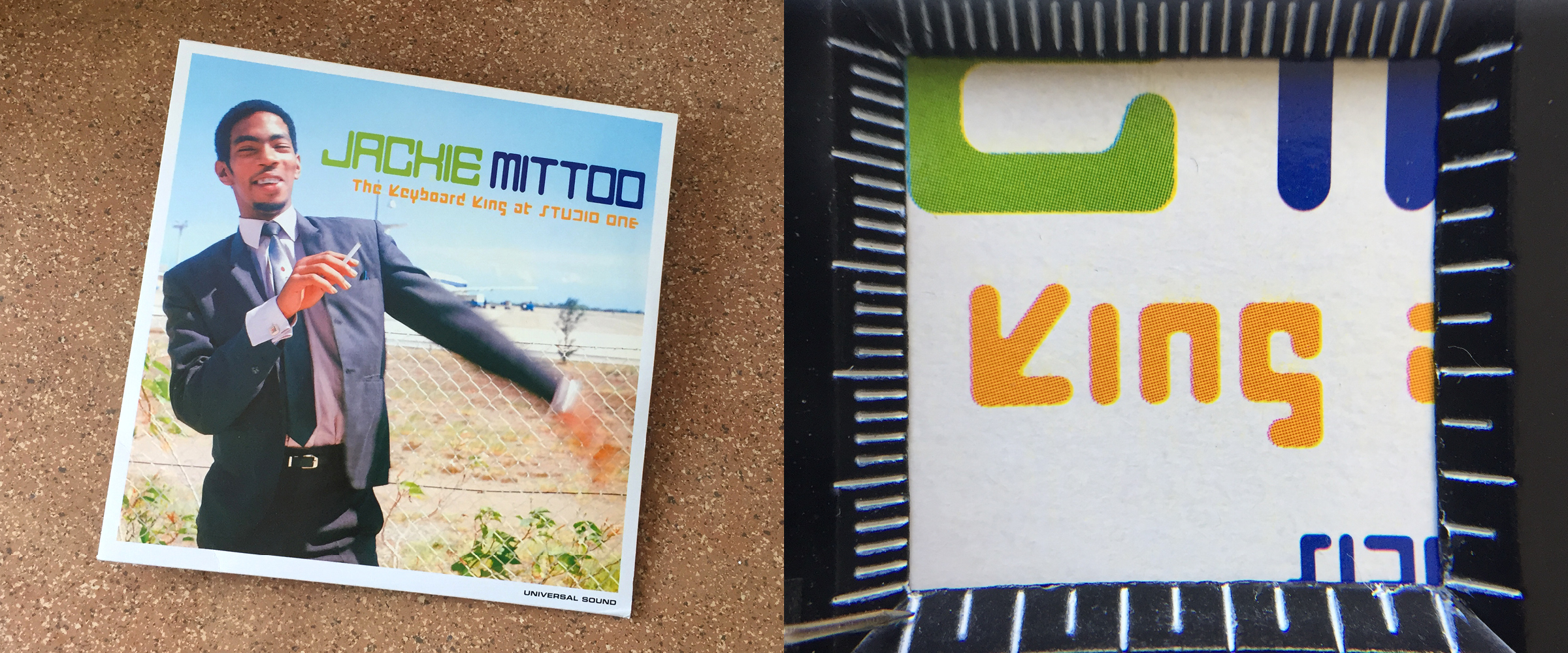
I have fairly recently discovered the work of Jackie Mittoo, an acclaimed reggae keyboarder, and have since then kept an eye open for more of his work when browsing record stores. When I found the album “The Keyboard King at Studio One”, a posthumous compilation from 2000, I had three reasons to rejoice: the first two being an amazing double record and the third one a rather unexpected modular typeface, used through the whole design in one regular weight. Many things caught my eyes there and, while listening to Mittoo’s cadenced organ lines, I started roughly digitising what I could find — radical, very constructed structures — making for a pretty meditative activity.
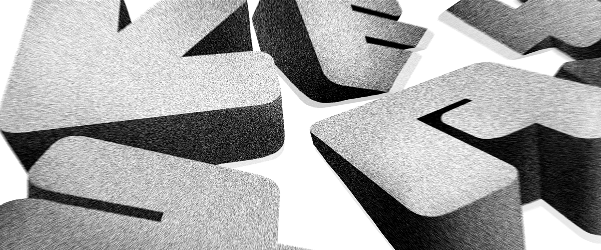
Although the typeface used on the record cover was obviously rounded, my first instinct was to give it sharp edges, somehow feeling what it would bring someting more contemporary, more, well, edgy, I guess? I stood by this decision for a while, even after having started to expand the character set beyond what was available on the original source, even after testing translating it into various weights. But it eventually began to sound jarring. I hit a wall, motivation dropped and I had to sit down and actively try and remember what I first perceived in this design. Then it became clear: what actually drew me was in big part a feeling of erosion, the softness of the letters, as if gently nibbled by sun and salt over the course of centuries.

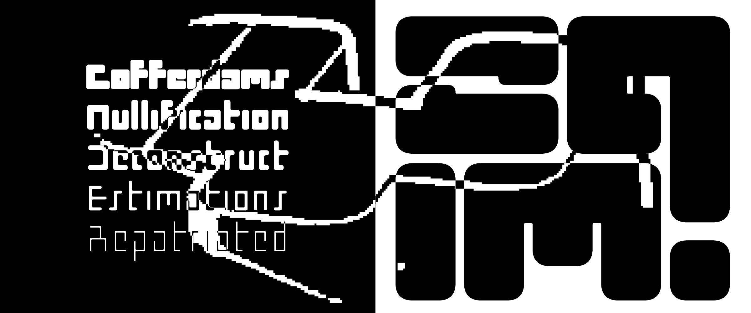
And it is more than a rounded finish. I’m talking broken connections, entire missing bits and unnatural excrescences. I was mentioning very constructed structures, yes, but they are almost just as much deconstructed, often offering hints instead of definitions. Reading then becomes a guessing game, a (quite easy) puzzle, gaps waiting to be bridged. This reduction of letters to almost abstract forms guided many decisions in designing the Keyframe family — keeping in mind the constraints of low-res pixel typefaces as well as radical experimentations like Wim Crouwel’s renowned New Alphabet or the more recent work of French designer Simon Renaud. I had to trust reading habits, sometimes sacrifice legibility, accept the strict and sometimes unfair rules of my own game.
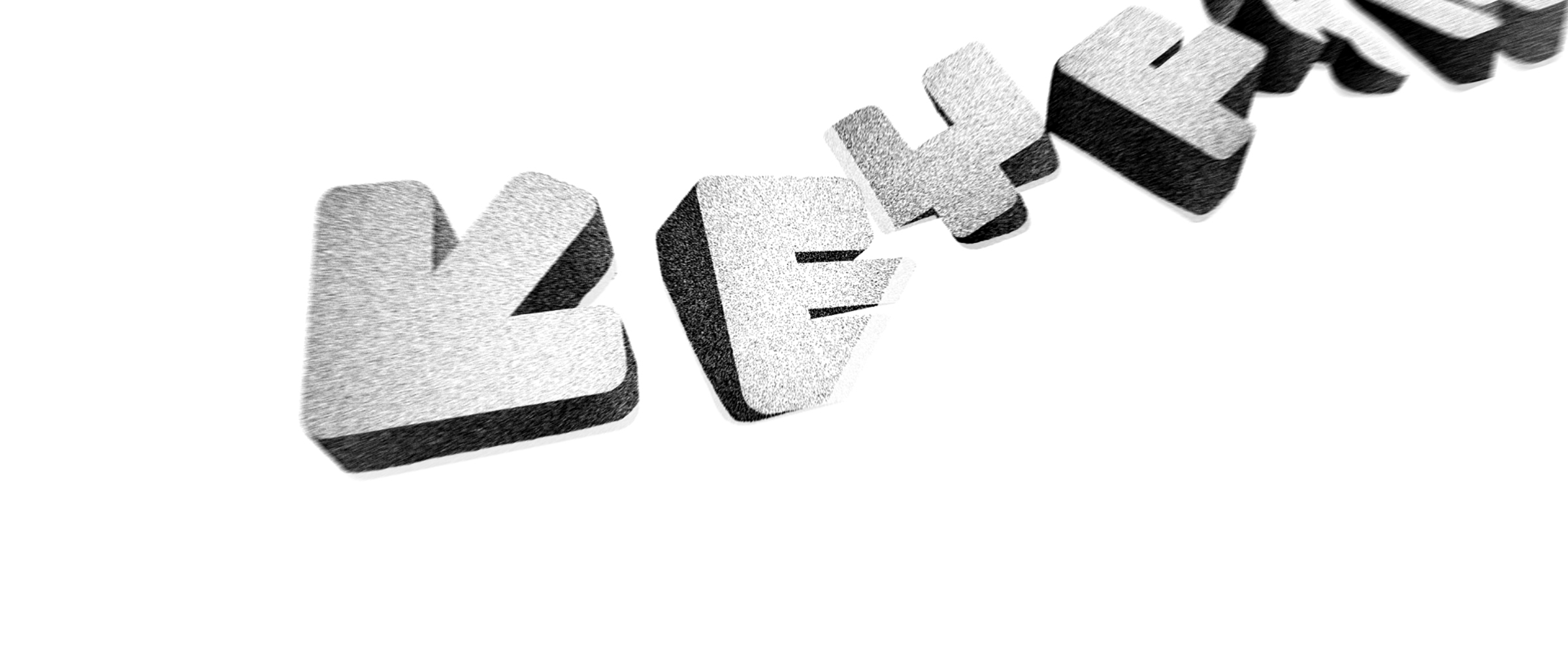
Although Keyframe sports a very orthogonal look, what kept me wanting to bring it to life were its eccentricities, a bit of warmth that pushes it in a non-robotic direction. The sparse use of diagonals, such as in the peculiar letter K, paired with slightly unbalanced shapes like E or t, carry something analog, or organic. To me, the whole typeface walks a fine line between miniature screens and monumental blocks of concrete, between futuristic sci-fi and ancient remains. I imagine its letters popping out in a thrilling novel from Jules Verne or Lui Cixin, discovered in the middle of the ocean where they’d been lying since long before opposable thumbs were a thing. Or something of the sort.

Keyframe started as a pressure-free leisure-time revival-ish exercise before moving into the “why not casually release this small one-style thing” category. But I confess, I am weak and just couldn’t resist the curiosity of translating the design into extreme weights. I get so much satisfaction from the systemic aspect of type design. No element is ever there just for itself, everything is relative to the entirety and must coexist. I love the moment when the design itself becomes my co-pilot, when I feel like we’re taking the decisions together, when sometimes I even let myself be completely guided, logic coming into play to reveal new things. Now the Keyframe family consists of five weights, each of them bringing something to the table — from bent-wire Thin to architectural Heavy — uncovering new reasons why the original design caught my eyes.
It is strange to work from an unidentified source, particularly one that isn't very old. There have to be traces, maybe very precise information regarding the original typeface, its creator(s) and the context in which it came to exist. I tried to investiguate to be best of my abilities, but in vain. And I made my peace with it, I never intended to have a scientific approach or anything, my drive is more emotional than anything else. But still, it is nice to give proper credit so, if anybody reading this happens to have a clue, I would definitely welcome it!
In any case, I am very happy to see Keyframe out in the world. The five-weight family is both forward-thinking and slightly nostalgic — a mood that the accompanying animation work by Elenor Kopka translates perfectly [⤤]. And while the design process included more cold logic than I'm used to, the result is packed with spirit and curiosities, making for a very recognizable and surprisingly functional typeface, ready to brave the wild elements of our modern landscapes!