Hi all, here’s Lucas Descroix — I'm happy to announce the launch of Plain Form, my new typographic practice!
After some months working in the shadows, it feels equal parts great and scary to finally push the button and make the foundry live. Website is up, font files generated, all that’s left to do now is, well, celebrate for a bit, then start working on what comes next! Plain Form is barely out of the egg and I’m already feeling exhilarated and almost freed, knowing that from now on I’ll have this platform as a home for whatever projects I feel like working on — unconventional type families, strange collaborations or, maybe one day, non-typographic stuff. Oh, I love non-typographic stuff.
Have a look around our website and consider following Plain Form on Instagram and Twitter — I mean, if that’s the kind of stuff you’re into. And below are a few lines about the current catalogue and some wishes for the future!
Only the plainest of forms (or is it?)
Starting this foundry, I want to explore my work without compromises, be in control of every aspect (or choose not to be), express myself through various mediums. Plain Form aims at being an open, positive and exploratory space; where no standard would ever feel safe from being questioned and reinvented; where letters are considered for the absolutely magic assets that they are, a fascinating raw material for our culture and communication; and where users and readers are believed to be smart, capable of manipulating or understanding typography in all of its flexibility and ever-expanding potential for novelties. Big words, big words… but I mean it!
Two new sprouts, all soft and green
With the launch of Plain Form, I'm releasing two new type families; two very different projects that stand as a sort of manifesto, a guide map to what the foundry aspires to be.
→ Petit Frère is the quiet sibling of some of my more outspoken display typefaces. It was created as an attempt to translate both Grandmaster and Nostra into more text-ish faces, respectively Petit Frère Narrow and Petit Frère Wide. Turns out, both of the original designs share many elements, inherited from the way that they deal with space constraints — either not having enough or, well, having too much? Petit Frère seizes this to propose the two extremes of a centerless design space, two different takes on the sans-serif lore meant to complement each other. Don't be shy, say hi to the siblings!
→ Ready is unique in the Plain Form catalogue so far, in that I'm not the sole designer. It was created together with Benjamin Dumond, a long-time friend and collaborator whose work I've always admired. Benjamin writes fictions and articles on typographic potentials and publishes them on his platform Grifi — which you should check out the second you're done reading this article. He's also indulging in DIY creative coding.
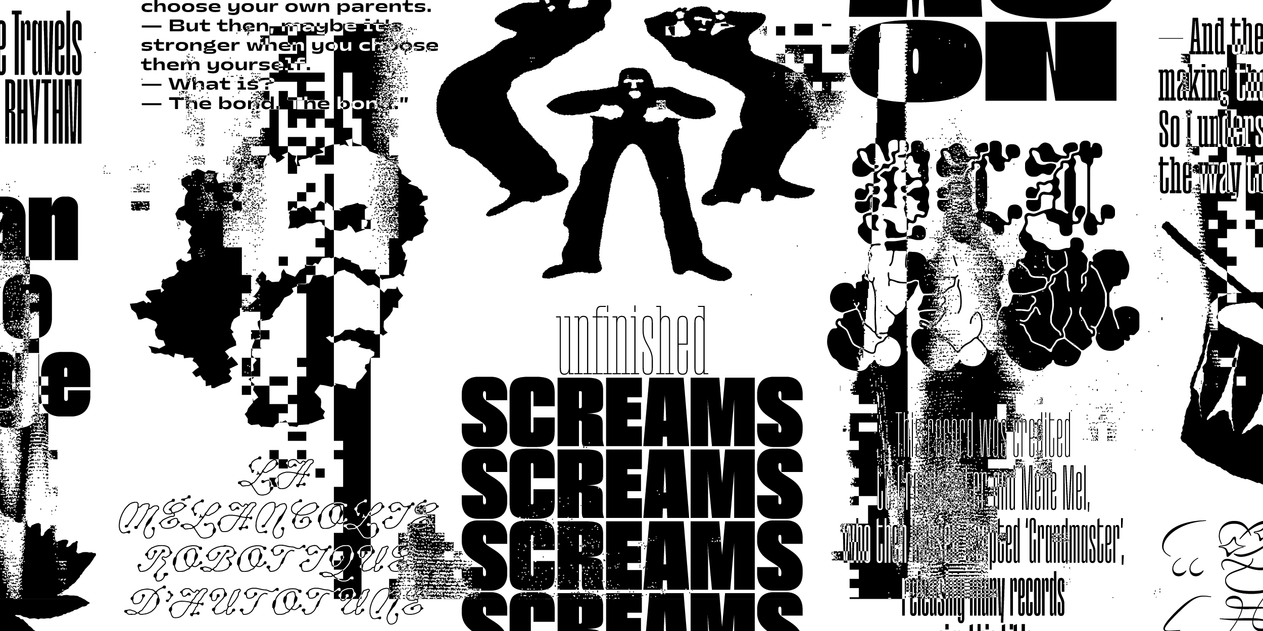
The typeface we made together, Ready, is not one for the passenger seat. This collection of display styles explores an asphyxiation of sense under an exuberance of the sign. Marrying historical letterforms with the organic unpredictability of “reaction-diffusion” algorithms, Ready does more than flirting with abstraction: it tips over into becoming pure shapes, only sprinkled with a few hints of our long-established and codified writing system. And it comes with its own mini-site, can you believe it?
Freshened up for the first day of school
Existing typefaces, that I’ve made and released in the past, are still very much part of my practice, of who I am, what I do and where I want to go. They keep on helping me shine a light on many topics, drawing lines between different projects. Feels like it wouldn’t have been fair not to have them in Plain Form, just for the sake of starting fresh. That’s why the catalogue includes three type families that were already available — but all of them coming with new surprises.
→ Grandmaster, initially released with The Designers Foundry back in February 2018, was my first-ever retail typeface. An almost kinetic condensed sans, suitable for big sizes and striking headlines. I have recently re-worked its entire look, but also expanded its character set to the Plain Form standards and added corresponding slanted styles, for when a slant is needed, which happens.
→ Nostra will always have a special place in my heart. After an initial work-in-progress release on the platform Future Fonts in July 2018, the unlikely couple was updated monthly before joining the hall of finished typefaces in April 2019. I feel like it fully profited from the lively and flexible process allowed by Future Fonts; I saw it being used as I was working on it and got enough positive feedback to keep me going all the way to including patterns, emojis and, with the final update, support for Cyrillic. Translating Nostra into a new script had been such an enriching experience that I wanted more and, under the critical eye of George Triantafyllakos, went on designing a Greek companion.
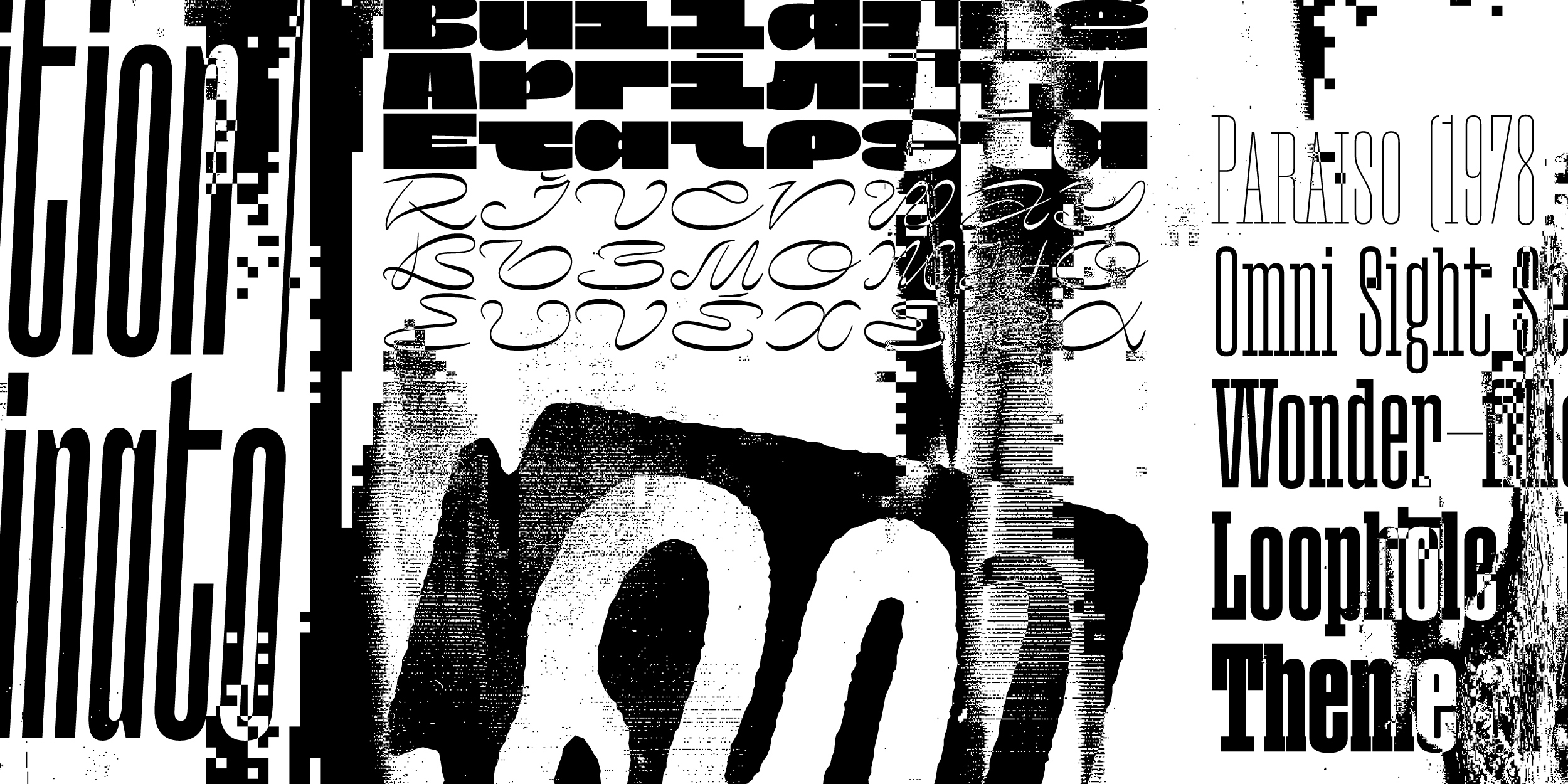
→ Paraiso is actually graduating today from Future Fonts! Big day for this small one. Initially released in July 2021 as a humble two-weight slab serif, it now reaches the finish line with seven styles, including a chunky Sans and its italic counterpart. Together they form a stable, non-nostalgic and surprisingly versatile family.
What to expect
First, thanks a lot for even reading these lines! It already feels like support and it means a lot. I have a number of projects, or rough ideas, for the future. Typefaces that might either be released fully or go through Future Fonts, depending on what seems to make sense. Collaborations that should allow me to explore new territories, surprise myself so I can surprise you better. Maybe objects, artworks, custom typefaces — so much is possible!
So, thanks again, and I hope Plain Form will fill this letter-shaped hole in your heart.