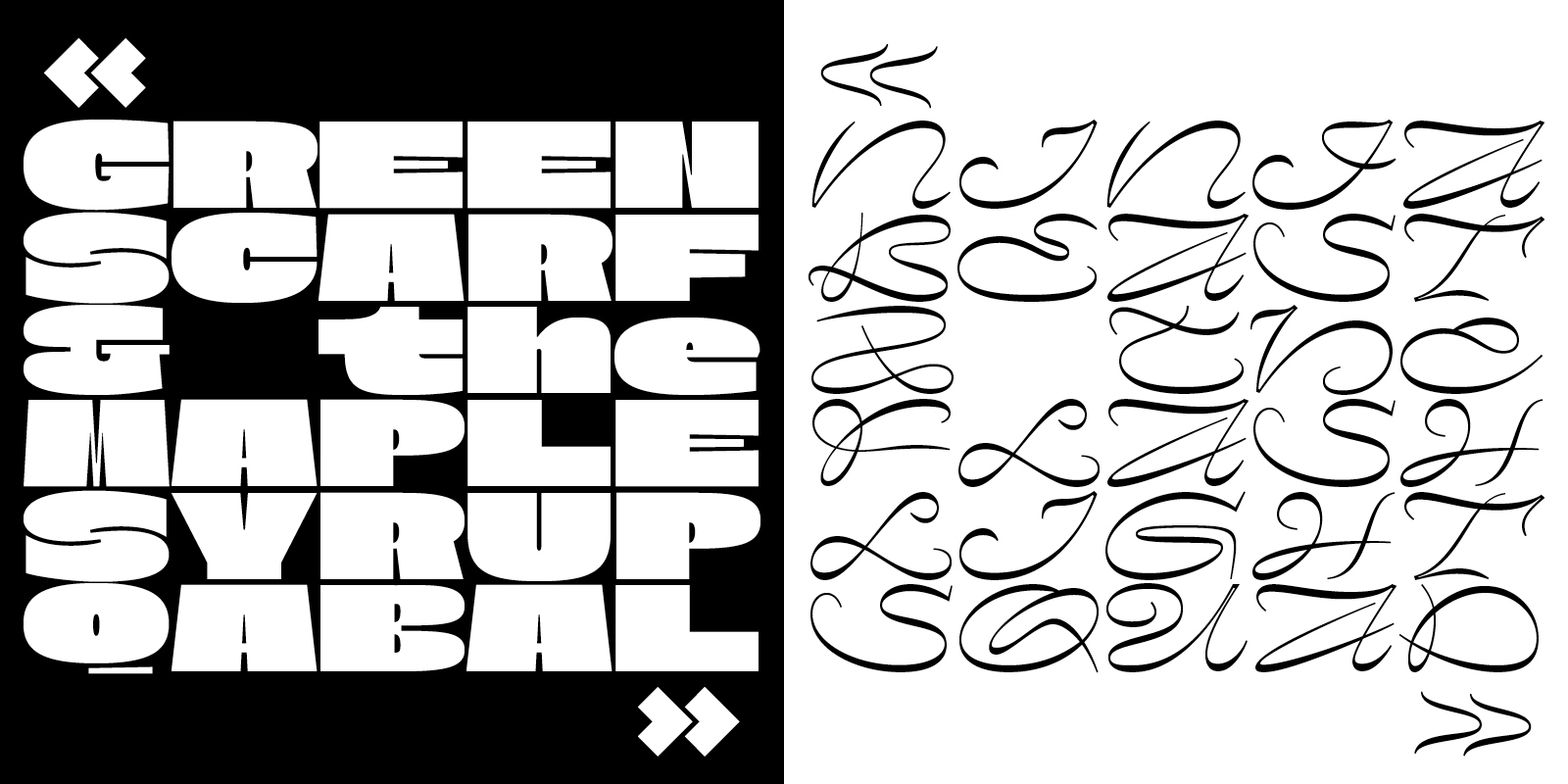
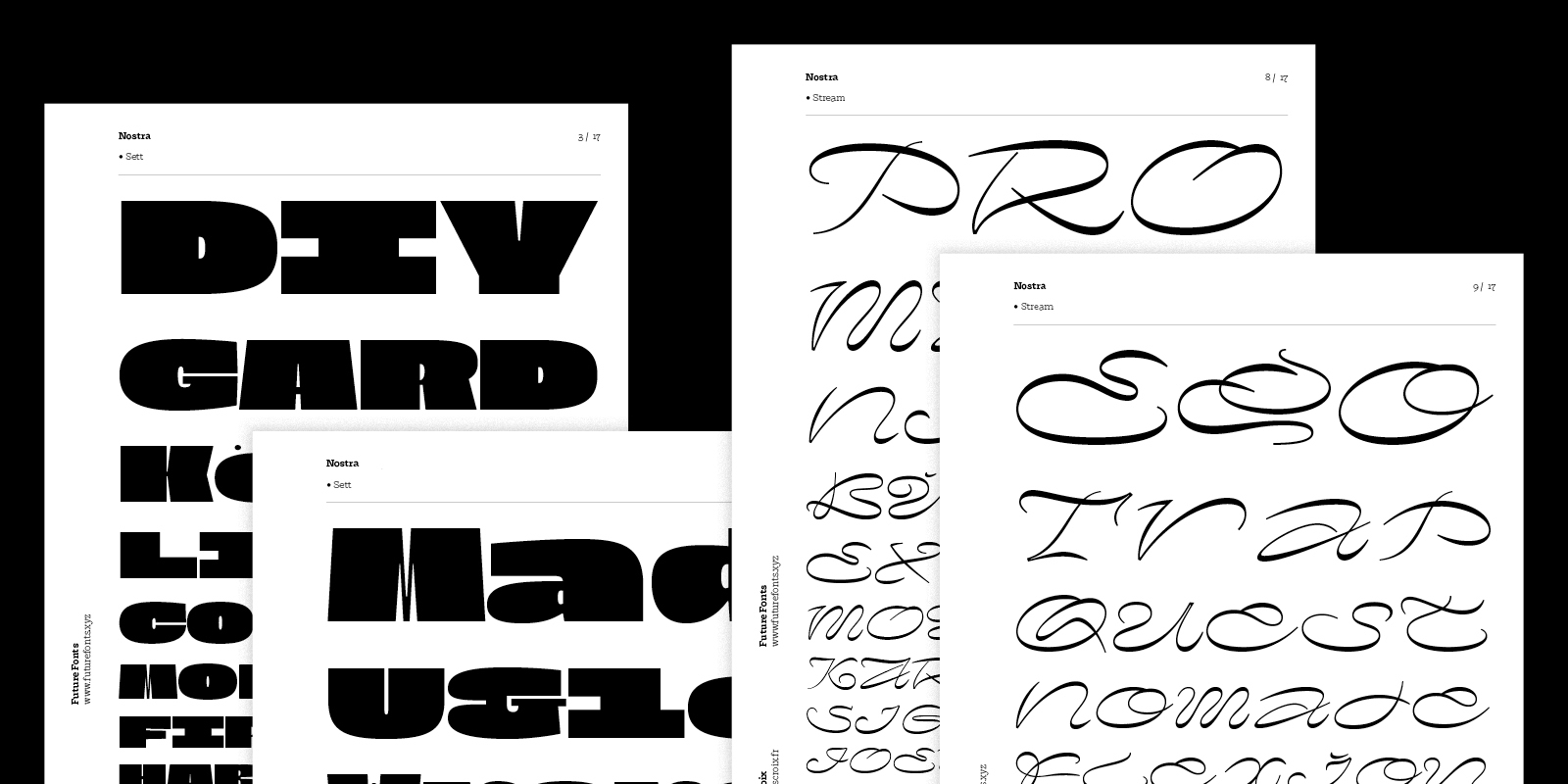
Nostra is an extra-wide monospaced type family. Playing with a feeling of satisfaction — how a few thin strokes can create the shape of a letter, either cut in a solid mass or traced in the air — it presents an atypical couple of roman & italic, only brought together by their extreme proportions. Its fixed-width makes Nostra a perfect fit for pattern-like layouts, aiming for that border between a legible and an abstract system, a bloc of text and an optical illusion.
But the truth is, Nostra wasn’t born as a couple. The first set of capital letters that later became Nostra Sett emerged back in 2016, with the idea of building something wild yet extremely controlled. With this purpose of manipulating a raw mass of matter within a constrained space, working with fixed-width felt like an obviousness and the wide proportions easily followed, as they forced the letters to adapt to an unusual environnement, creating perfect conditions for lots of funny surprises.
Coming from graphic design, I have learned to love grids, columns and gutters. I developed an interest for strong contrasts and, looking closer and closer at letters, diving into surfaces of black and white vectors, I found the same brain-tickling appeal in the border between shapes and counters.
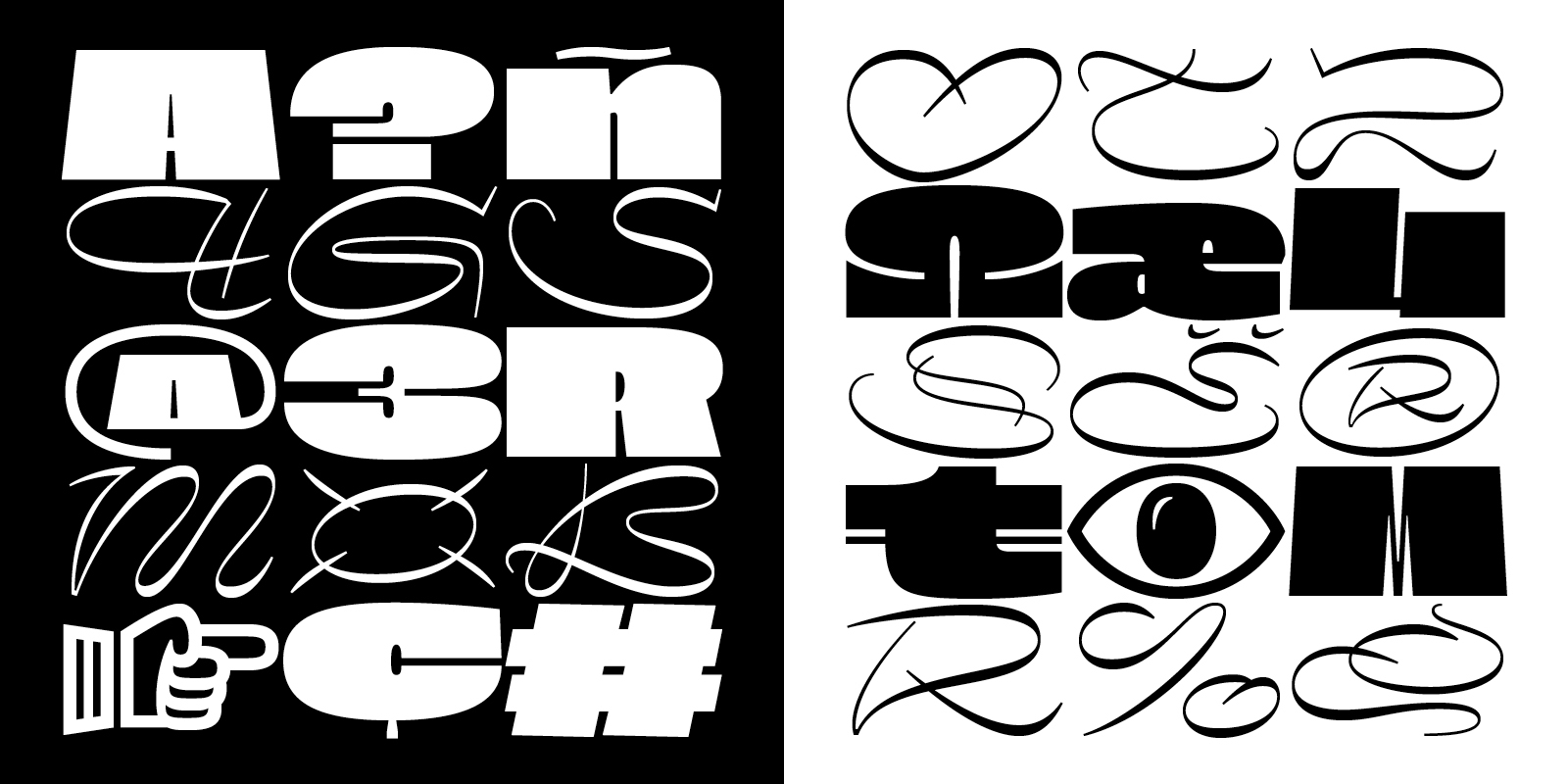
Nostra Sett’s letters are very blocky, with counters pretty much equal to the side bearings, creating a maze-like effect, particularly when used in all-caps. Some letters, like the peculiar capital S, are also conveying the feeling of an impossible gesture, with strokes kind of curving inwards into each other.

As I was drafting the first set of upright letters, I joined the National Institute for Typographic Research (Nancy, France) where I explored italics, in their history and forms. There I got to discover what can make a type family and how much the space between romans and italics is more of a scope based on habits than any objective set of rules. That’s where surfaced the idea of two coexisting styles that would find their similarity somewhere else than in weight or a general likeliness of style. Two companions that everything opposes, that only become one thanks to an extreme parameter: their extended fixed-width.
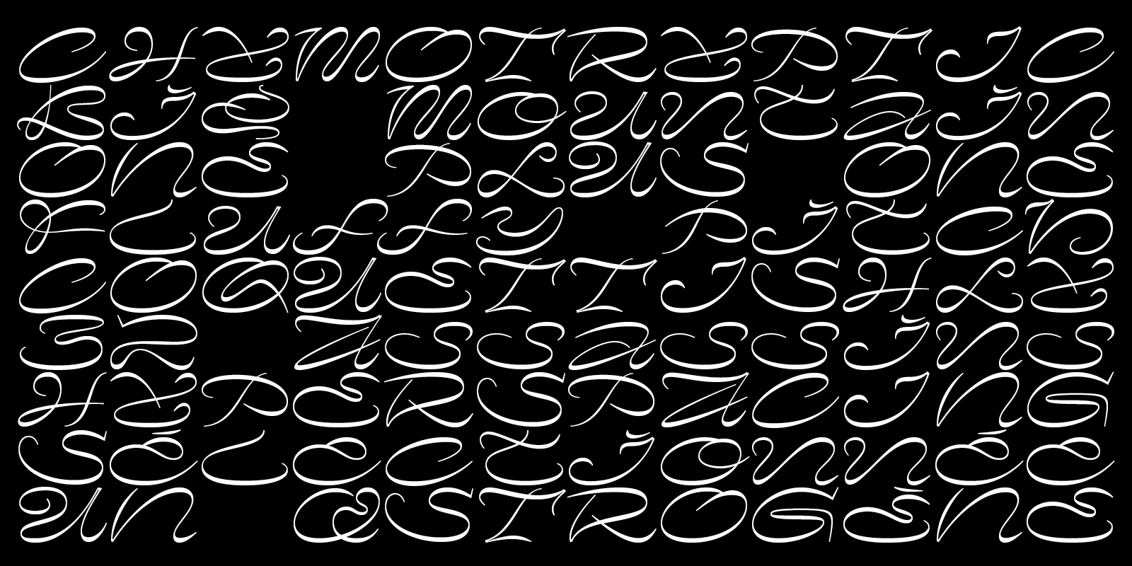
When the time came to give Nostra Sett an italic, I started by describing what I had in a few words — something like “stable, straight, thick” — and drew the opposite. Nostra Stream borrows a lot from ornamented scripts and street graffiti, but the image of ‘snakes in jars’ was the most significant while designing; the idea of sinuosity in a box. It was fun coming up with solutions on how to fill up the space, compressing all ascenders and descenders and imagining unusual ductus.
Nostra is a kilo of lead and a kilo of feathers. Two distinctive elements that instinct would separate, brought together by a common measurement. Their co-existence is not based on harmony but on tension, not on habits but on senses. Tiffany Wardle described it as “crazy, wild, hypnotizing witchcraft” and I want to believe that what is happening between Sett and Stream has something of a magic trick.
As a graphic designer, I’m used to combining typefaces according to a feeling of togetherness, often brought by extreme contrasts. The way I conceive type families somehow follows this practice.
In September 2018, Typotheque revealed Nikola Djurek’s excellent Brenner and described it as combining “seemingly unrelated styles into one large superfamily’. Earlier that same year, my friends from Bonjour Monde and I released Syne, an open-source type system designed as an “exploration into atypical associations in weights and styles”. In the the accompanying notes, I proposed the idea of type family as potentially similar to the artistic gesture of ‘Ready-Made’, where the creator’s will and decision is what makes it a family, more than any preexisting logic.
When Nostra was first released through Future Fonts, in July 2018, the steady Sett already had a good basic character set while curvy Stream was much more limited, with only capital letters, figures and a little bit of punctuation. Over time, they slowly evolved into their final form.
Both styles actually started as uppercase alphabets and it was hard to imagine that they could work otherwise; now the lowercase actually seems necessary to the whole visual system as it brought a lot of interesting shapes, due to a diversity of proportions and a complexity of structures — I mean, a monospace extended script g with no descender, you have to get creative!
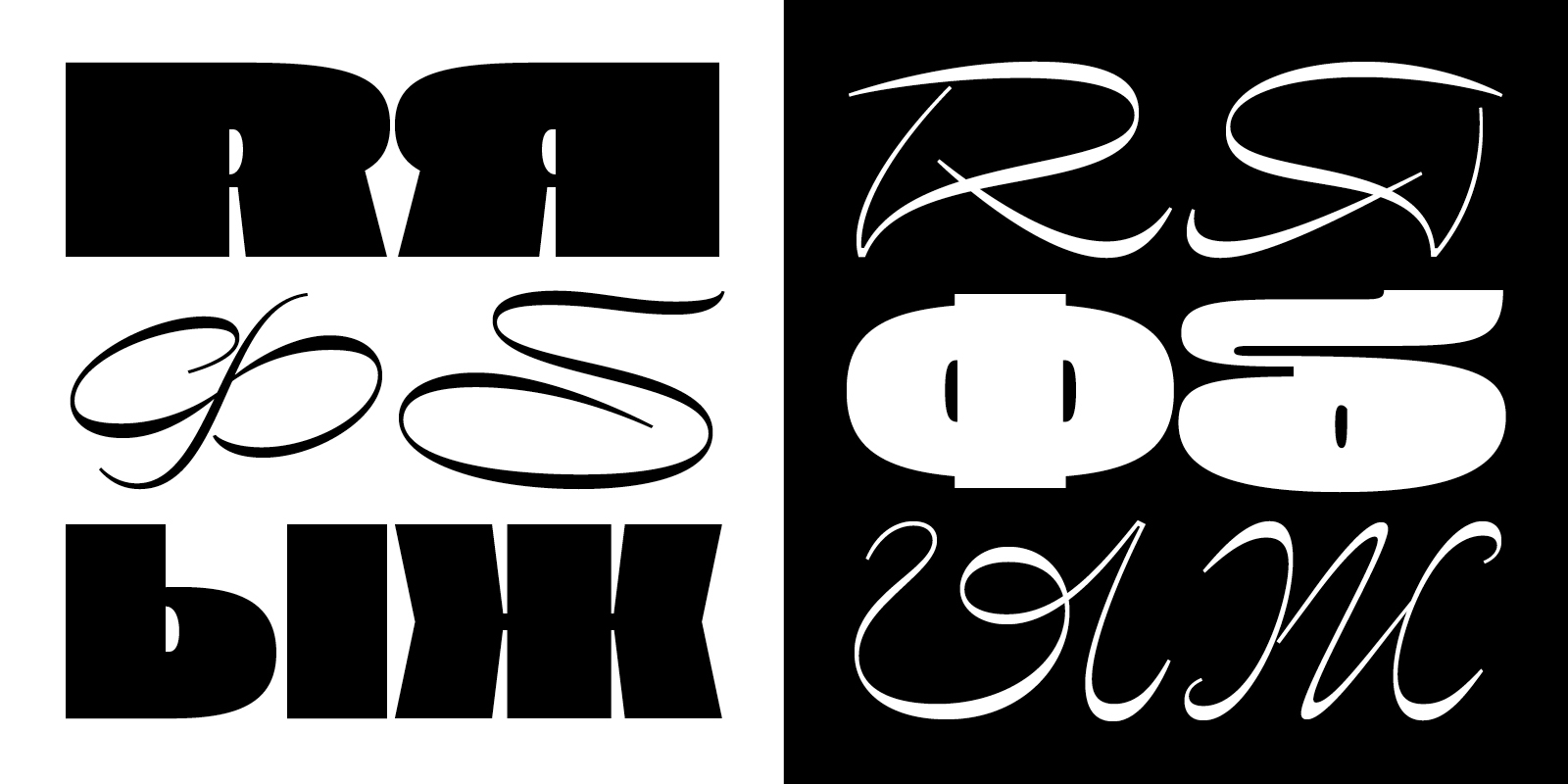
From the very beginning, I wanted to explore the potential and originality of the new marketplace that was Future Fonts. I immediately planned nine monthly updates following the initial release; each month would come with its dose of new glyphs and features, pretty much in the order of what I judged to be necessary. For such a strange display typeface intended for uses such as posters or book covers, uppercase and figures were mandatory, followed step-by-step by lowercase, punctuation, basic diacritics, symbols and extended language coverage — all the way to a Cyrillic companion.
My system turned out to be very pleasant to work within. Each update was a clear mission and the mountain that the design process can sometimes appear like felt much lighter. Having to deliver only a specific part of a typeface was nice, knowing where to stop each month, what's going to come next. One could argue that it wouldn’t leave a lot of room for improvisation and requests from customers. The thing is, I didn’t get a lot of those and most of the time they were exactly what I had planned for the next step. I guess people are not going to ask for a Cyrillic extension when the typeface only has a handful of glyphs.
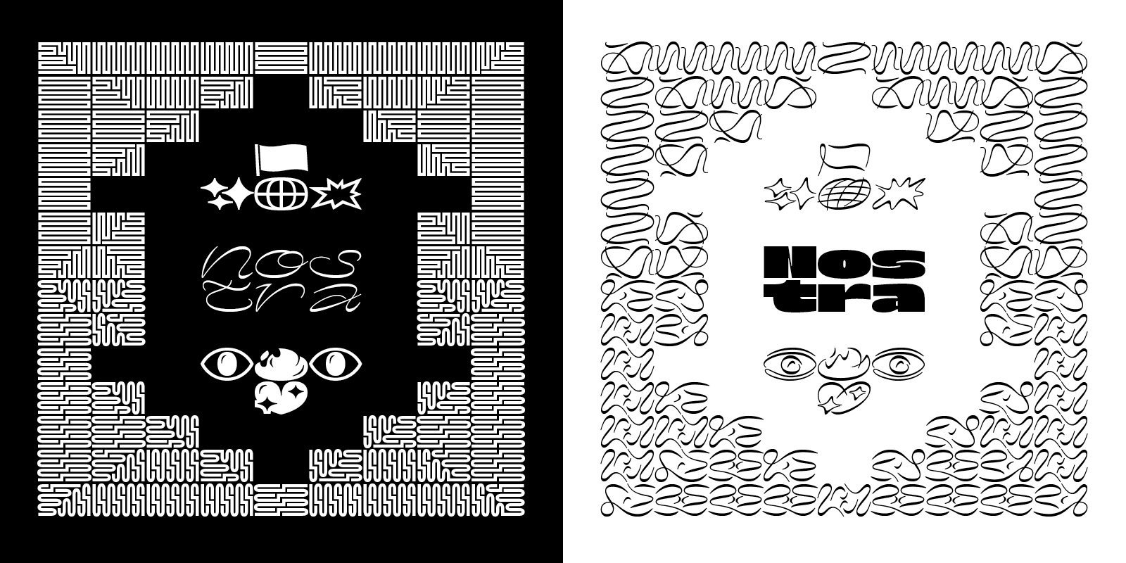
And I actually did improvise. Although I wanted to make symbols and emojis from day one, I had not imagined that translating Nostra’s visual system into non-typographic shapes would be that much fun. So I went out of my way and tried myself at borders. The idea for Cyrillics also came much later, inspired by a couple of requests that made me want to keep on surprising people — and myself — and not just fill empty boxes.
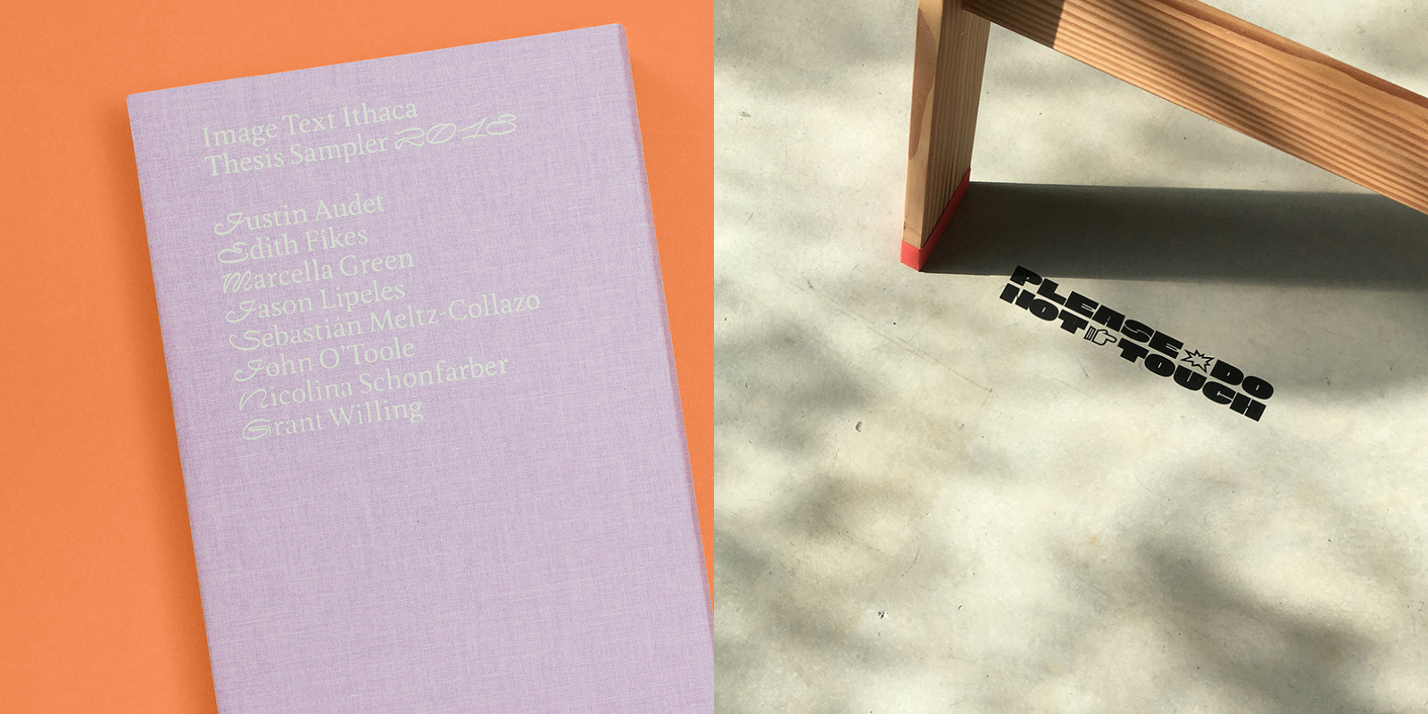
A good part of what makes Future Fonts so great for letter drawers like myself is the community support: the feedback from skilled type designers (fellow Future Fonters and others), the encouraging comments and the regular uses by graphic designers during the project's development. I have been constantly surprised by the ways people found to use both styles of Nostra. I’ve seen them stretched, used as initial letters, both set on top of each other… I had designed emojis and fractions mostly for my own amusement and was amazed to see them on a poster just a few weeks after the update. How cool is that!
It’s no doubt that having this audience and seeing my letters used in all possible manners gave me a constant push during the ten months of designing and updating. It’s also no doubt that such a strange experiment would have not found the time to be fully carried if it wasn’t for Future Fonts and thus its creators, Lizy Gershenzon, Travis Kochel and James Edmondson.
Nostra started as an exploration into the unity of opposites but it has been mostly a great visual playground, a monthly exciting challenge for almost a year and I’m happy at the thought that it’s now going to live its own little life and be used in more unexpected ways.